Monday 5 December 2011

HAPPY CHRISTMAS


                                      Textile picture of 12th century church at Brentor, Devon

Thursday 1 December 2011

CHAPTER 5 - Spaces Make Lines

3.5.1
Trying to do something a bit different, the second one down with small triangles on top, didn't quite work out as the white triangles got a bit distorted. I like the five circular ones that look a bit like Easter eggs best.

There is lots of scope when using different shapes - I think the bottom one with a fairly straight line looks the strongest.
3.5.2
Why do I like to make things tricky for myself! I was attempting to make secondary lines in between the main lines in the cut outs.  I can't believe this took an hour.  Still I do like it, and the colours certainly are contrasting.
E.A.
All these lovely fuchsia blossoms were on the ground after the violent winds we had a couple of days ago and looked much prettier than the slates that came off the roof.

Now I have to go and start my littlest grandson's 1st Birthday card - where has that year gone.

Monday 28 November 2011

CHAPTER 4 - Printed Lines

Ink Pad and Mark Makers
The first thing I did was make an ink pad, using a very small plastic box plus felt and silk paint. I was a complete revelation to me that one could use silk paint successfully and I had never thought of making my own stamp pad. Here is is with a small selection of my mark making tools.
3.4.1
The top line is the mini pink & yellow rubber shown above. I bought a set of 6 just because I thought they would be interesting for printing.

The lower half of the next page is done with my much loved Koh-i-Nor graphite stick
This blue page is, top half done with one piece of dense foam that I saved when new glass windows were installed and there were loads of them stuck to the glass. Bottom half is yet another mini rubber with an interesting dent in it.
These green ones are above mentioned bit of foam and the lower half the tap swirler.
Purple and green are done with four bits of window foam stuck unevenly together.
3.4.2
The first one was good fun to do.
Having made my dinky little stamp pad, I didn't get around to using it 'til this last bit. I love the fuchsia colour and think I will probably make quite a few more in interesting colours instead of buying them.
Another very interesting chapter!

Sunday 13 November 2011

CHAPTER 3 KANDINSKI

I spent 3 or 4 days on this one, just couldn't make up my mind how I wanted it. Each time I tried a different composition and changed a few of the components, left it for a while and then went back to it. I'm still not really satisfied with it, perhaps it needs more going on? More lines and wiggles?

Saturday 5 November 2011

CHAPTER 2 CREATING MOVEMENT WITH LINE

I used a Classic Gel Pen for the first couple of exercises, some turned out better than others - some got torn out and thrown away.
Next was a Micron Pen
Edding Profipen.
I should have tried thicker pens than these, then perhaps it would not have been some hard on the hands
Had to stop for quite a while because the patterns are working as they are supposed to - visually disturbing - got a migraine. Next used Uni Jetstream

3.2.2   OP ART PICTURE

I tried out half a dozen patterns before I settled for this. First I thought I would do it in just black and white with some shading
Then I took a photocopy and did a blue and yellow version. I didn't think the white background did very much for it, so cut it out and tried it on green

Hmm, still not very exciting. Then tried it on some patterned paper I have been hoarding.

Still could be better, so then I tried this.  Is it OK to use commercial papers for the background? This really seemed the perfect one

That was a really interesting chapter!

Thursday 3 November 2011

MODULE 3 - WALKING THE LINE

3.1.1 Mark Making
I have always liked using pencil, especially softer ones and always write my shopping lists with one, so started with these. I really love the great big fat Koh-I-Nor graphite stick at the bottom of the page.
I had forgotten just how messy these oil pastel sticks can get.

Inktense is just as messy    
The Stabilo at the bottom of the page is new to me - it looks like a child's pencil it is so chubby but is so different when used wet.
Hope the pencilled info alongside the Quink marks can be read OK
My lovely Koh-I-Noor stick again. I find this very soothing to do,
A mixture of pens and inks here, I enjoyed the dip pen in Indian Ink most here.
3.2.1 Matchsticks
I should have realised that the blooming ink would show through from the next page with these.

Extra Activity


3.1.3. Moods and Feelings

Again it is a real pain that the next one Tranquility is messed up with the reverse page showing through

After an enforced 5 weeks of not doing any sketchbook work, then guests and half term with grandson,  I found it quite difficult to get going again, but hopefully will be able to catch up and keep going now.


Wednesday 19 October 2011

PS TO MODULE 2

I went to an exhibition at the Devon Guild of Craftsmen - 'Signs for Sounds' which is on until 30 October. It shows contemporary Letterforming and Calligraphy;  Stone carving; some "Unreadable" letters formed with giant brushes; Grafitti; Typeface with Accents; Poetry and other displays.  It was very interesting and thought provoking and the food in the restaurant is very good as well.

Wednesday 7 September 2011

MAKING SKETCHBOOKS Chapter 10

Another very addictive past time! It was good to be using the many many papers that I have made over the last few weeks and perhaps realising which were suitable for some particular purposes.
2.10.1
I started off by making four Folded Stitch Books, with different themes. One was pages of lettering, another painted and woven sheets, a third left over printed words in different fonts and lastly one that was really rather too small, and I used for just putting a stamp on each page. Sometimes when they come in the post, they are too interesting/pretty to throw away. This last one needed a lot of clamping to make it stay shut so 8 pages is probably maximum for that size.
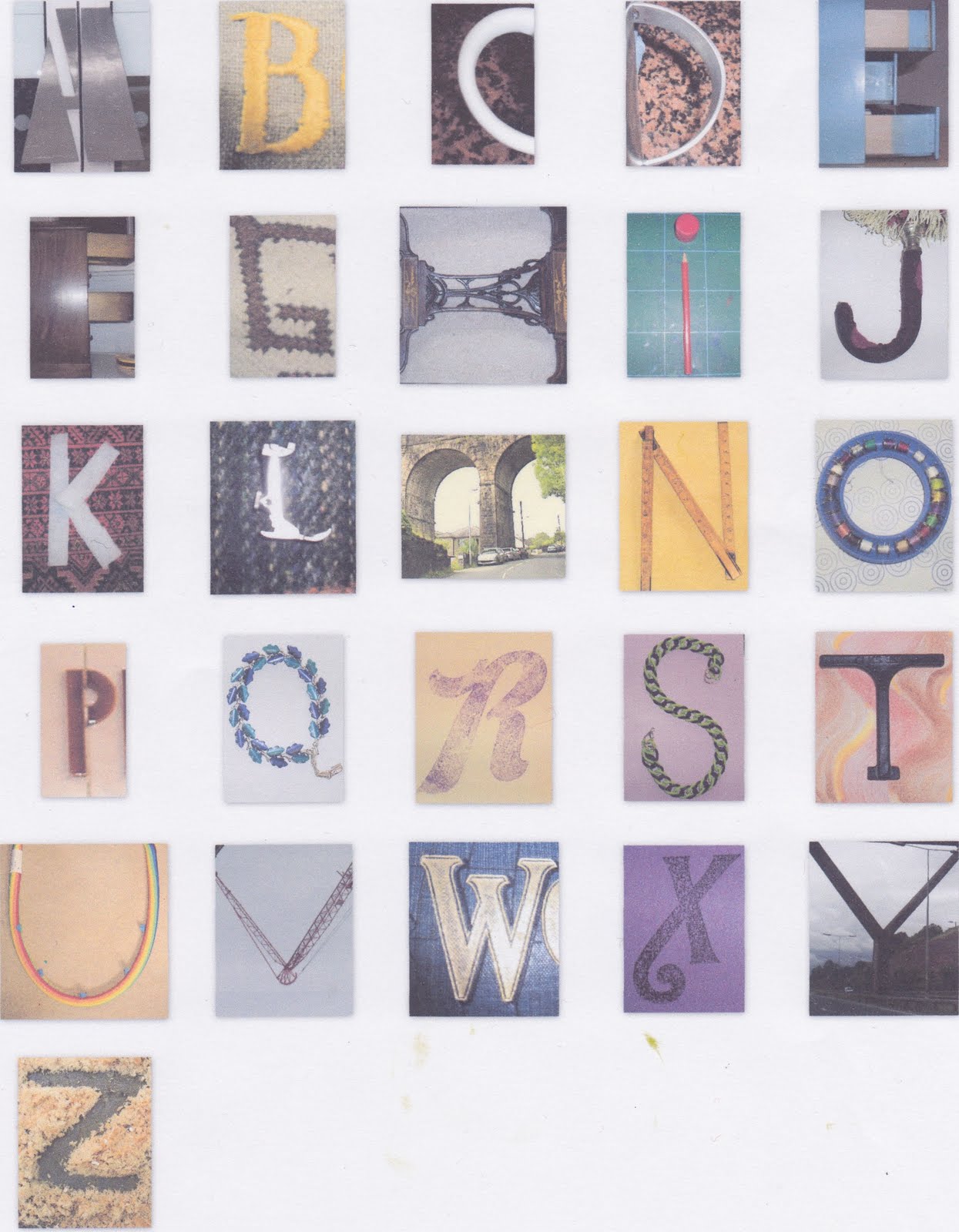
Next I made the Stab Stitch Books. as before with different pages inside. Since I had taken a photocopy of my Klimt motifs, I used this for a very small book.


2.10.2
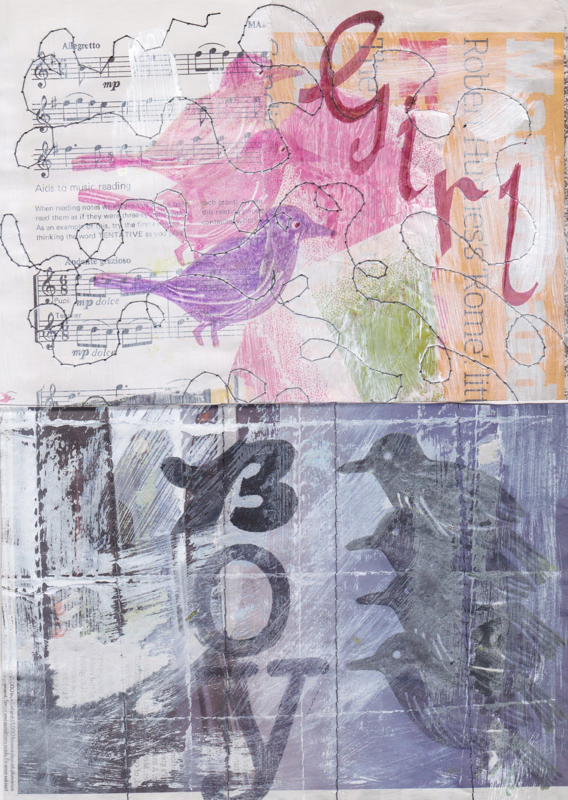
My theme for the main Stab Stitch Book was the nursery rhyme about magpies. I must have changed my mind about what I was going to do dozens of times. Anyway I think a Stab Stitch book is probably easier to organise as far as the page order goes.

It was probably not necessary to show the individual pages, but at least as they are only A5, they don't take up quite so much space. The first four were straightforward.


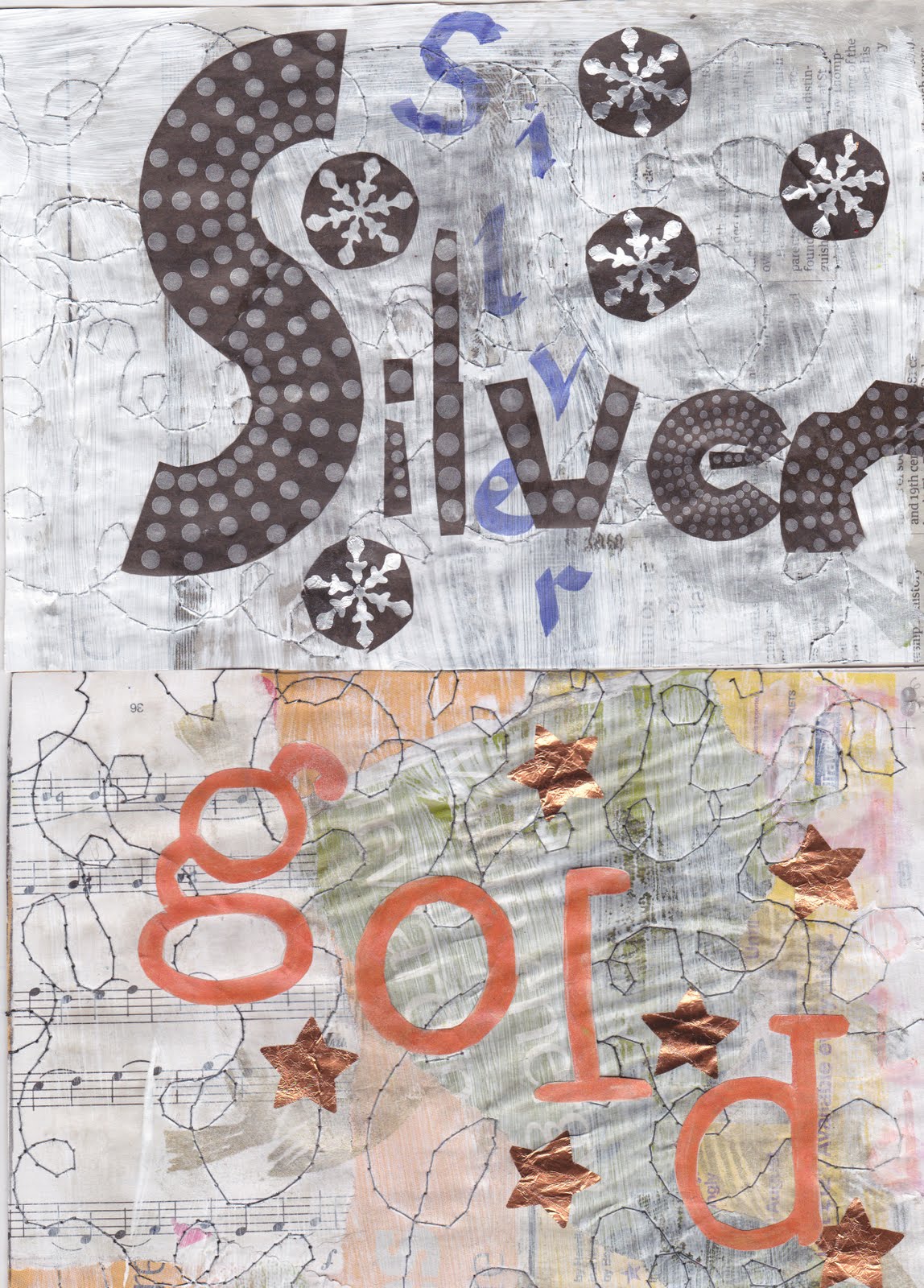
I had the idea of making the 'bird' stamps from Fab Foam when I was making my letters and copied them freehand from a bird book. When I came to use them for Silver and Gold, I used a couple of ink pads. Big mistake, the next day they were still not dry, I suppose because the paper was no longer porous. So -  design opportunity - I wiped them off and changed what I had been doing. But the original birds are still lurking under there somewhere.


Back to the birds. I realised page '10' was not long enough, but it was quite easy to extend it at the stitched side and this bit is hidden when it is all put together.


The book cover I glued onto card both sides of the front cover and back.  It wasn't too bad drilling the holes because I have a (?) pink Japanese hole punch with six different size heads, which is very neat but the two sheets of card and more than 10 pages (because some of them were several layers) was as much as it could take I think.

I have enjoyed getting to grips with the stitching on the second sort and am looking forward to some more variations in the next module.

Sunday 4 September 2011

LETTERS & PATTERNS Chapter 9

I had managed to get a very large book on Gustav Klimt out of the library and looking through it, I noticed that many of his motifs are used again and again. His paintings must have been very time consuming as the tiny details seem quite obsessional.  It was very interesting to make a note of some of the most used ones.
2.9.1

The colours for this piece started off based on his picture 'The Virgin', but I think the yellow is just a bit too bright, it would have looked better in a slightly softer colour I think.  I find it a bit tricky not going into 'zentangle' mode when doing these.
2.9.2
I started off my letter exercise by painting the background with blue Brusho. Of course when I got glue on it the colour was not fast. Oh well.  I ended up cutting most of the pieces of paper and foil by hand individually. The red triangles are from foil that was round an Easter Egg, so it was good to use it at last. The round gold spots I punched out with a hole punch, but this foil was from the top of (I think) baby food, so it was much more substantial, as were the silver spirals. The black and gold flowers, plus the tiny pink and gold rectangles are from wrapping paper. The green around the gold spots is glue pen with foil rubbed down on it.  When looked at in close up, it is very broken up and bitty. I was disappointed with the gold paper from a greeting card envelope as I think it looks a bit like brown paper. The G was painted with gold acrylic with some foiling on top. I'm not sure about the balance of the design. Is it lop sided?  Anyway fun to do over several days.
I love the example in the Extra Activity section, the colours are so elegant. It is something I may well go back to do sometime.

Sunday 28 August 2011

USING MY CAMERA Chapter 8

This exercise has been going on for weeks.  Of course I now 'see' letters everywhere and am slightly obsessed with them!  Although taking them all and deciding which to use and which to reject was great, the afternoon spent trying out everything on my computer was a big headache. My lovely daughter in law has moved, and is very busy so I thought I'd better give it a try.  The first lot ended up printed out on 3 x A4 sheets, which wasn't the idea. Next up was all on one sheet with a couple of repeats, but part of some letters missing.
Next try was a 'mosaic' which fitted everything together as Picassa thought best, well at least there wasn't any repeats.
Finally though I still don't know if this is what was wanted, Picassa and I together decided to give this one a go!
Well I may have ended the afternoon with a great big head ache, but nonetheless I was delighted to have learned to do some new things without any help.  I also noted the computer has kindly opened a file for me called collages with all the drafts etc in it so I can play again another day.