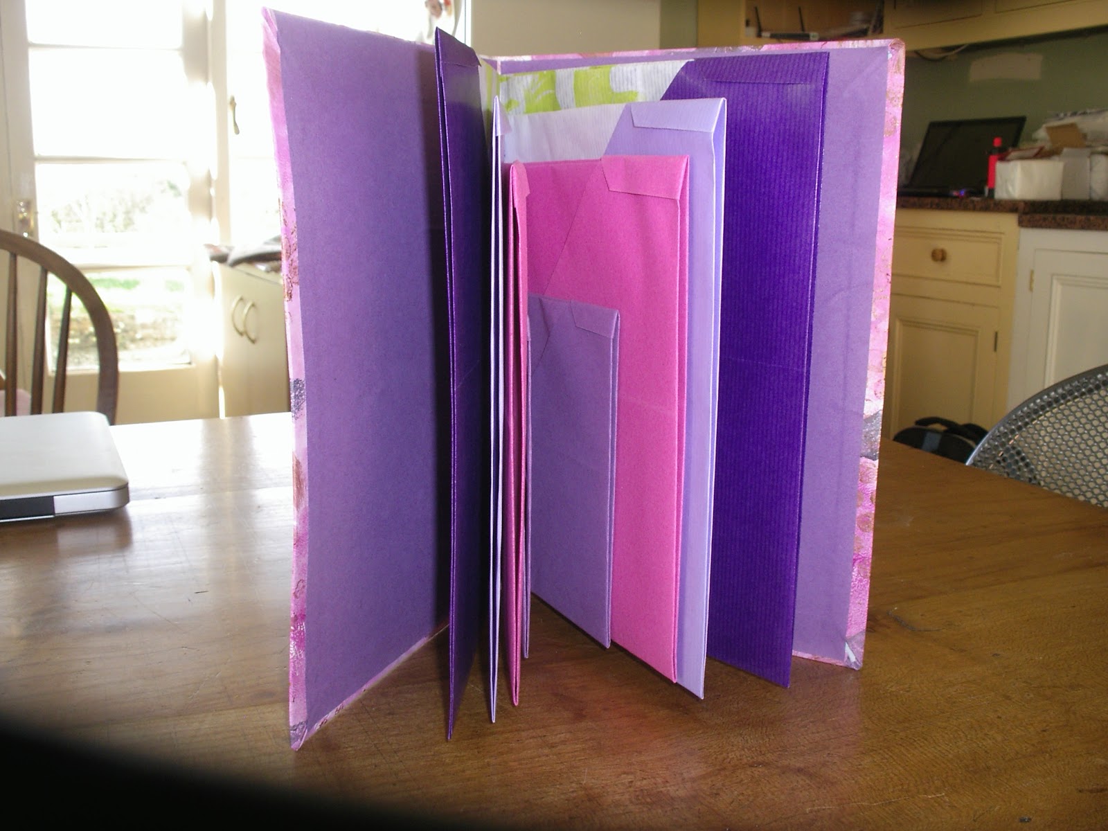
Thursday 29 November 2012

MODULE 5 - Figure and Form

Chapter 1 - Making a folder

It has been such a long time since I last posted anything, but we are still not back in the house, well we have the use of the kitchen but that is it and it is really hard work going out to a barn and rummaging about to find cord etc. Still we are getting there and hopefully will have some rooms ready for Christmas when we have family coming!

I liked the idea of most of the folders but because I love origami I settled on that one for my folder which is a bit over A5 size. These as predicted are fun to make.
Here are some of the sheets, two of which are coloured kraft paper with some painted decoration on the white side and the smaller ones are sugar paper.  Although my top corners are not tiny triangles I decided I liked them anyway.


The paper for the cover is painted using acrylics, bubble wrap, collaged paper, printed tea bags and a home made hand block. It is wrapped over a piece of cereal packet on the front cover and card from a pad on the back. The inside is covered in sugar paper.
I'm so sorry I have just realised I haven't cropped these, but if I stop heaven knows when I will get back.

The holes were made with my very useful Japanese hole punch and threaded with thickish purple cord.


For fun I made a few others, but just showing this one, made from an old Molly Makes calendar which has interesting pages.


 The scanner is refusing to work today hence all photos. Mine you with all the dust in everything it isn't surprising, I know how it feels.

Anyway the next chapter of drawing shouldn't require much searching for materials so I will try and get on with that.


Monday 10 September 2012

Module 4 - chapter 10

Altering a book

The original book was about birds in the USA.  I removed about half of all the pages and stitched the remainder in pairs. the subject was opportune as some phrases were apt for my story.

I will start off with the cover which in fact I did last. It is not as I hoped but I have run out of time as the house is being demolished around our ears and I wanted to get it finally done. I would like to make a new cover some time in the future, perhaps out of textiles to slip over this one.

The gesso has been coloured with Inktense, the Owl & Cat applied and then coated with acrylic wax. This was not a good idea as the applied paper then began to run and messed up the colour. Also I wouldn't have done the title as I have, given more time.


Almost the whole of the book is coloured in Inktense pencils and blocks. The pages for the end papers were first coloured then a diamond grid pencilled on. The owl is a commercial stamp but I made the stamp for the cat from fab foam and extremely fiddly it was too.


In retrospect I perhaps didn't need these two pages but decided to put in the title on one page and some information on a hand made luggage tag on the other. The reverse of the tag says 'The Owl and the Pussy Cat written by Edward Lear in 1867. Illustrations by Janet Gent 2012.  It is fastened by a brad through some hand dyed cotton ribbon so it can be turned over.  The silky thread  on bottom left hand side of the page was hand stitched and then of course the colours went through onto the next page.


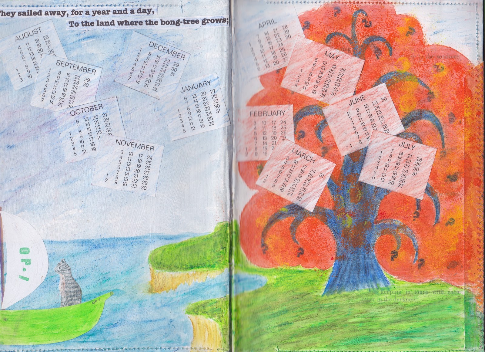
I had intended to keep the stitches white on both pages but it didn't matter.  The start of this whole idea was the thought of doing the story of them going off in a green pea boat not the other (correct) way around. As with most pages the pictures are collaged onto the background. The sun was intended to be stamped through to the yellow on the previous page, but it was just too thick.


I had to use the reverse of the stitches from the previous page so this time they turn into the flight pattern of honey bees. The honey was a photo I took of a lovely tin of French honey I bought ages ago. I wanted to make the coins so used card circles covered with chocolate money foil, so not entirely round. I love the colours on these pages and the way the pencil over the rough gesso gives extra texture. I enjoyed lightly touching the machine stitching on the edge of the pages with Treasure Gold.


Oh I know it is corny but I couldn't resist making the owl with a beak that opens and closes with the movement of the page and the outspread wing is loose and flaps to and fro.


I was just so lucky that I could get the word 'dawn' into the sunrise here. I very much enjoyed looking for various words and phrases throughout the book that could be left peeping through the colour.


Hmm what does a Bong tree look like? It took days to come up with this answer and I decided there could well be more than one, so made the first fold out into a second tree with free machining for extra texture.


The first Piggy page has the reverse fold out of the Bong tree on the left and three extra fold outs on the right. These trees are the ones that gave me so much grief in July trying to work out how to make them look light enough. I made the stamp for the tree from Fab Foam again and didn't back it with any card. This meant it was floppy enough to also use individual branches as well as whole trees. First I did the background, then trunks and branches then more greenery.  The tiny birds were cut from wrapping paper to brighten the trees up a bit. There is a tiny extra touch of gold on parts of the trees.


This triple fold extension now goes to the left of the next page


In some ways I think this is my favourite page. The bride look so pleased with herself, perhaps it is the real owl feather in her lace headdress. The owl and turkey wanted a lace buttonhole too.


After all my previous experimenting with quince stencils and masks the following double page has ended up quite low key. The mince is 3D crumpled tissue and the pieces of quince on the plate are separate slices only fastened in the middle so they stand up on the plate. The runcible spoon was about the fourth edition I tried. It is metal tape on foam with square sequins, a scrap of Angelina and some gold cord.

The final page consists of three separate pieces of pop ups. These are a direct result of the Paul Johnson books that I have bought and got from the library. Getting the angles on the second and third sheet was quite a game. I liked the idea of the extra stand ups that can be added to the main pieces and made several clumps of grass as well as the sand castles, though they are not so easily seen.  The moon (which is a semi circle though doesn't quite look it) was coloured with Markle silver and opalescent. I found myself seriously thinking 'now what does a dancing cat look like?' Perhaps I have spent too much time on this book!


Altogether a thoroughly enjoyable exercise. I had the luxury of being able to indulge in spending lots of time on it and it took my mind off the ever worsening building works.

Tuesday 24 July 2012

Module 4 - Chapter 8

Developing drawings
I have used a quince which will be part of my book, to try out simplify and repeat. I also wanted to try various medium to find which I wanted to use for the book. The first is acrylic and gouache. The lilac background is very thinned gouache which lets the acrylic show through. The print was made with a stencil cut from card and sponged.
The next page is all acrylic with the cut out of the quince used to resist the blue of the background (sort of) on top of the gold colour
This one is Markle and Brusho. I like the way the Brusho breaks up over the top of the Markle. Extra flecks of green powder dropped on wet Brusho. Three different size stencils used. I started also drawing around some of the cut out shapes but didn't like it so took it no further.
Orange and green one is gouache and Brusho. I think I just painted carefully around the green shapes on this one. I like the casual effect.
The top part is acrylic stamped with a shape made from foam and mounted onto card. Then background is Brusho.
The trees underneath are part of a great many tries at getting a forest effect.
This one is HORRIBLE and just one page of 6 or 7 tries all of which were horrible. I liked the idea of making a stencil of a tree and overlapping it, then sponging the background, but they were too heavy. However I eventually cracked it as I gave up on acrylic. Sorry it is side on.
My new flavour (material) of the month is Inktense!  I very much like the fact that you can do one colour, wait for it to dry and then use another over the top without it mixing with the first, but also can blend it required. This is a small sample.
I will be using this throughout for my book and have in fact made a start. It was looking at the work of Paul Johnson and liking the light bright effect of his work, which I think was described as pigment colouring that made the penny drop.

Gosh it takes a fair old time doing the Gesso primer doesn't it.

Monday 9 July 2012

Module 4 - chapter 7

BOOK ART


Pop-up books have been a favourite of mine for many years, I bought a very early Meggendorfer moving book, tinted by hand many years ago but I now collect some of the modern books.


Sue Blackwell, my goodness what a prolific lady. In addition to books she has done full size installations, theatre sets and window displays for top stores. She has featured on book and  magazine covers. I wish I had noticed the Waitrose March 2012 cover I would have got a copy. Her sculptures were influenced by SE Asia when she lived there. Sue always reads her books first.


Frances Pickering. This lovely lady has a new book coming out in October called 'Under the Cover'  which shows textiles and brown paper amongst other things. I was very taken by the fact that she is selling original pages from her book 'Page after Page' with the money going to the charity Sight Savers.


Paul Johnson has work in the Tate Gallery and New York. He is on the Craft Council's select list of British designer - makers. I think his books to encourage young children in literacy etc are amazing. I was able to purchase one of his books on line for 1p! + p&p what a bargain as well as fine one in the library. He will definitely be influencing my own book at the end of this module.


Jan Pienkowski. I love his sense of humour and have several of his books for children and some which I think adults would also love.  If you ever get a chance to see Botticelli's Bed and Breakfast it is great. I was showing it to a close friend when she said she had been at university with him and knew him well. Our Polish Builders have helped me pronounce his name correctly at last.


Robert Sabuda. I have many of his books, my favourites being The Wizard of Oz and Alice in Wonderland. I actually bought the former in Kansas City and was slightly miffed at finding it for sale in the UK. These two both have mini books inside many of the pages and W of O has a pair of 3D glasses to see the Emerald City. I also have some of his lovely greeting cards.


Kate Farley is a lady who also teaches book making and finds it complementary to her own creative practice. She used collage, photography and print making and likes to make work that "challenges visual interpretation of site, space time and experience".


Ron van de Meer claims he was the first paper  engineer to insist that adults could be as fascintated by pop-up books as children.  He has produced books on subjects such as architecture, music and psychology which have been best sellers. Pages can be opened to reveal 3D items of The Sydney Opera House, sailing ships, an orchestra or a volcano.


Paper Engineering and altered books seem to be a natural progression of my decades long love of origami stemming from my childhood Rupert Bear books which I have passed on to my own children and now grandchildren. 

Tuesday 3 July 2012

Module 4 - Chapter 6

Raising the Surface
On the top of this first sheet I have taken Viv's idea and used my tracing wheel. It had also sat unused for about 35 years! The first square is done in wavy lines in two directions and the second in only one direction. I used a piece of foam underneath, but think that felt would have been better as suggested. The bottom two are cut out and partially stuck down stars and cut Vs of various sizes. I very much like the latter and have done many variations in the past.

The second page, top l.h. corner, cut and partially folded back. Top r.h. corner, probably a bit too subtle to show up but it is corrugated finely in both directions and looks a bit like damask. Bottom l.h. various size holes punched with an old dental instrument (I think used for tightening braces?) An interesting effect, but the throat is not very wide, so limited to edges. r.h. creased and stitched.

Third page top, split plastic straws woven through slits. Very bouncy. Middle commercial punch of cats cut out and stuck back slightly offset. Bottom black and white strips woven with thick punched dots glued to the squares. Quite fiddly. The thickness was supposed to cast a shadow, but it doesn't show.

I am a fan of origami, from way back when I used to look forward to my Rupert Bear annual with a new thing to make (with my mother's help) and I think some of the above is related to that. Anyway very enjoyable.

Tuesday 26 June 2012

Module 4 - Chapter 5

Drawing with colour

It was great to get out my Derwent Aquatone and Caran D'Ache Prismalo pencils again. This is a medium I have neglected in the past year and having used them again I  to appreciate their potential more. In fact I saw a friend using them on fabric at the week end to great effect. The Inktense is the only colour I have in this range, but my they are intense aren't they.

The first page is revisiting my peas that I did in module 3. I think the colours look a bit paler when scanned than on the page. I have taken liberties with the shadow colour under the peas.


I found it a little tricky not to blend the colours too much on the cat, so had to use the brush fairly dry. I also resorted to stroking a damp brush on the stick and then using it.


I used to take some of these with me if I was out at the beach for the day or somewhere with a chance to sit for a while, I will have to try and get back to doing that. I enjoyed this exercise very much.


Thursday 21 June 2012

Module 4 Chapter 4

Sgraffito
4.4.1
I started off with Crayola glitter crayons as I couldn't lay my hands on the ordinary ones. They are done on slightly shiny card and painted over with black gouache. For some reason they look as though there is no colour under them although I thought it was quite bright.
The larger tree is done with ordinary Crayola chunky ones (eventually found) and the colours again were supposed to be bright but appear quite muted.
The next picture of the sailing boat was done with Neo oil pastels and this time painted over with dark blue, it is done on paper which although I thought it was smooth, perhaps wasn't smooth enough.  I'm not at all pleased with it. I did another again on paper with paler paint on top which was so horrible it is in the bin.
Back to fat crayons and my slightly shiny card. The colours are weird for a cat, but at least I like him better and the pear is sort of OK.  But all of them even though they have been left for ages are dirty to handle, both paper and card with the paint coming off.  Is this normal and do they have to be fixed?

I quite liked the medium by the time I had finished but it is a pest if it has to be coated afterwards.

Sunday 13 May 2012

Module 4 - Chapter 3

4.3.1
This was very interesting and the sources are just endless. However here are a few

E.A.
As I had used a fairly thin tissue for the rubbings, these were coloured in thin watercolours.


4.3.2
I saw a beautiful hard backed book a couple of years ago which was photos of textures, divided up into man made, natural etc. I was very tempted to buy it as I knew I would never make such a comprehensive collection but I spent a very happy time in the garden walking around taking these.


4.3.3
Drawing texture.
A) I used several ordinary pencils and a big fat Stabilo 'Woody' water soluble pencil for the background, but I didn't like the effect very much. The bramble bush was growing though the coiled up wire
B) Oak was done with HB 2, 3 and 5
C- H
F) was done with a  Micron 01. I don't know what sort of bird feather this is, but I love it. G) was done with a combination of the Micron and pencil. I think it is from a sparrow hawk, left behind after he had plundered a nest of lovely long tailed tits. The bottom of it is very fluffy and the end smooth.

I'm not particularly satisfied with the above, but at least I have got going again.

Sunday 6 May 2012

4.2.1
MORE CATS
A few more sketches of my little girl (16 years old this April) Hebe. At least she spends more time sitting still these days.


It was rather a shock to realise I had not put anything on my blog for over a month. Still hopefully back to it now.