Developing drawings
I have used a quince which will be part of my book, to try out simplify and repeat. I also wanted to try various medium to find which I wanted to use for the book. The first is acrylic and gouache. The lilac background is very thinned gouache which lets the acrylic show through. The print was made with a stencil cut from card and sponged.
The next page is all acrylic with the cut out of the quince used to resist the blue of the background (sort of) on top of the gold colour
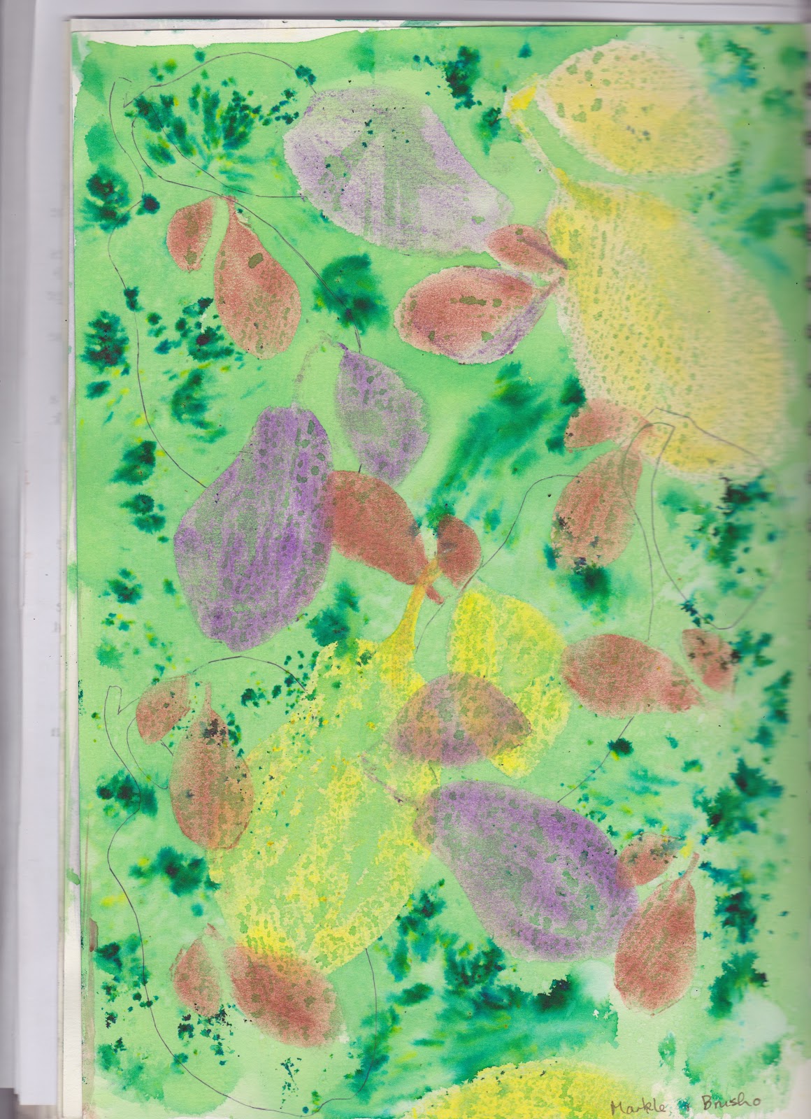
This one is Markle and Brusho. I like the way the Brusho breaks up over the top of the Markle. Extra flecks of green powder dropped on wet Brusho. Three different size stencils used. I started also drawing around some of the cut out shapes but didn't like it so took it no further.
Orange and green one is gouache and Brusho. I think I just painted carefully around the green shapes on this one. I like the casual effect.
The top part is acrylic stamped with a shape made from foam and mounted onto card. Then background is Brusho.
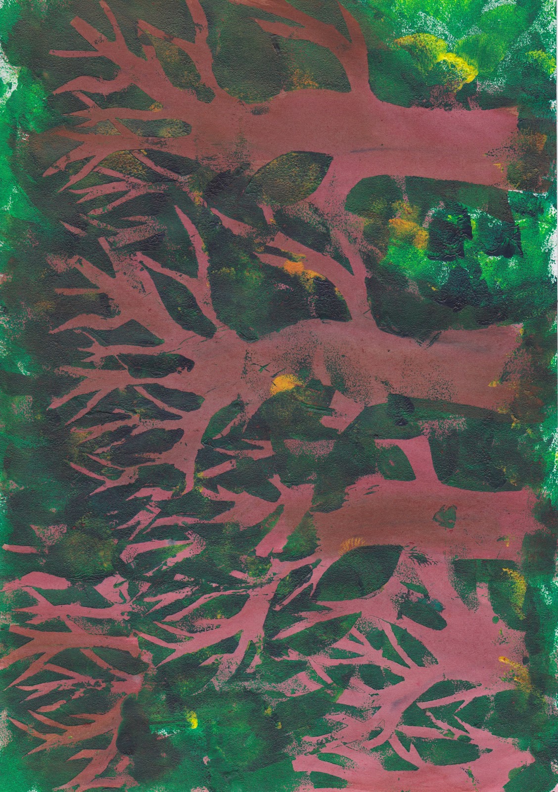
The trees underneath are part of a great many tries at getting a forest effect.
This one is HORRIBLE and just one page of 6 or 7 tries all of which were horrible. I liked the idea of making a stencil of a tree and overlapping it, then sponging the background, but they were too heavy. However I eventually cracked it as I gave up on acrylic. Sorry it is side on.
My new flavour (material) of the month is Inktense! I very much like the fact that you can do one colour, wait for it to dry and then use another over the top without it mixing with the first, but also can blend it required. This is a small sample.
I will be using this throughout for my book and have in fact made a start. It was looking at the work of Paul Johnson and liking the light bright effect of his work, which I think was described as pigment colouring that made the penny drop.
Gosh it takes a fair old time doing the Gesso primer doesn't it.


No comments:
Post a Comment