2.6.1 Printing blocks
I have a few lovely old wooden blocks in different styles as well as a set or two of acrylic letters. In addition I had already bought the alphabet set for children to play with in the bath and they have been used for that purpose quite a lot. I initially started by making just five capital letters, but then later decided I would find it really useful to have a whole set of 26 and made it up in lower case using the "American Typewriter" font. I have put them onto card, treated with button polish and put a tab on the back to make them easier to use.

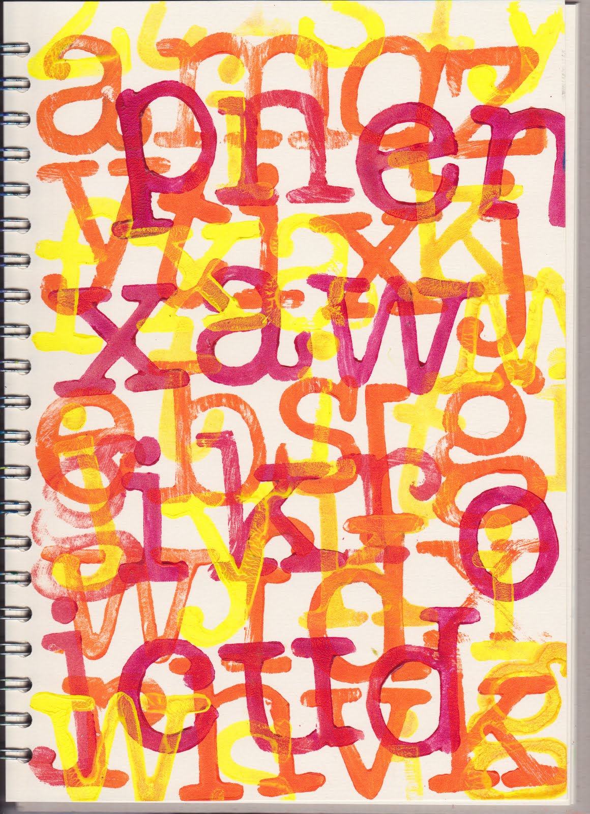
This is the capital letters I made first of all. Although I knew it would not be the best thing to do, I tried these out first of all without any backing card, using disposable gloves. This first page is quite neat and I liked the way the J travelled diagonally down the page, also the others.

This second page with the same letters I had the paint very slightly thinner and it all got a bit messy.


'No dancing'.

No comments:
Post a Comment