
Monday, 5 August 2013
Update on September 2012
Last autumn when things were getting very hairy here, I finished my Owl & Pussy Cat book in a bit of a hurry and I didn't like the cover very much at all. I have just got around to amending it. I used raw cocoon strippings, sprayed with dye and ironed with a hot dry iron. I cut out the heart shape to show the original pair, stitched some waves and stars and then glued it in place. I think it is an improvement, although they do look a bit washed out in the middle there.


Saturday, 3 August 2013
Module 6 - chapter 6
Printmaking with foam sheets
My printing surface is very quick to set up. I have a portable padded ironing board (with cutting mat on the reverse) that I use by slipping a plastic carrier bag over, that is an excellent fit and wipes clean.
6.6.1
To make some fairly basic printing blocks, I used the farm gate with the name Pittescombe on it, although I didn't really expect this to be readable, a lamb from one of my drawings and the words "farm" and "lamb". These were made from foam which I know I don't have an allergy to as I have been using it for many years, and also another block of a lamb using a piece of pizza tray.

a) this is done on plain black paper, first with white then blue. I think the black background is very effective.

b) This pale lilac patterned background doesn't really show up

c) The background to this is painted mauve and lime green, done ages ago for this course

d) This is one of my favourites in this chapter. Again a background that I have had for ages, the gate block is done in copper and the word 'lamb' oddly enough in a pearlised green textile paint. It was a new one and I wondered how it would look on paper.

e) The first of the blocks done combining the two methods. Not very interesting at all. Again it needs more going on in the background.

f) Getting a bit better, but the sponge too damp when applying the paint to the polystyrene.

g) I like this a lot more. I think this would be very effective sliced up and rearranged, but I won't do that just yet.

Come to think of it, some of the above that I don't like would benefit from slicing/dicing and a bit of extra colour. I did a few more, like one of lambs on a magazine page of wooly jumpers and other experiments, but they are not worth putting on here.
I have remembered my magpie block that I made for this course as well, he may get used later. I do like doing printing very much, so this was fun if not as successful as I had hoped.
My printing surface is very quick to set up. I have a portable padded ironing board (with cutting mat on the reverse) that I use by slipping a plastic carrier bag over, that is an excellent fit and wipes clean.
6.6.1
To make some fairly basic printing blocks, I used the farm gate with the name Pittescombe on it, although I didn't really expect this to be readable, a lamb from one of my drawings and the words "farm" and "lamb". These were made from foam which I know I don't have an allergy to as I have been using it for many years, and also another block of a lamb using a piece of pizza tray.

a) this is done on plain black paper, first with white then blue. I think the black background is very effective.

b) This pale lilac patterned background doesn't really show up
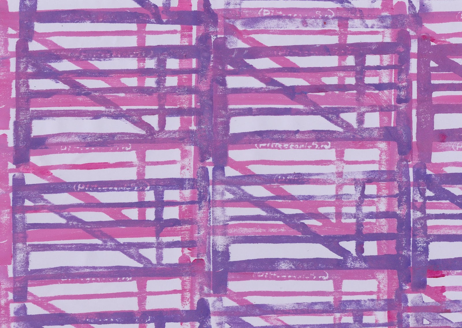
c) The background to this is painted mauve and lime green, done ages ago for this course

d) This is one of my favourites in this chapter. Again a background that I have had for ages, the gate block is done in copper and the word 'lamb' oddly enough in a pearlised green textile paint. It was a new one and I wondered how it would look on paper.

e) The first of the blocks done combining the two methods. Not very interesting at all. Again it needs more going on in the background.

f) Getting a bit better, but the sponge too damp when applying the paint to the polystyrene.

g) I like this a lot more. I think this would be very effective sliced up and rearranged, but I won't do that just yet.

Come to think of it, some of the above that I don't like would benefit from slicing/dicing and a bit of extra colour. I did a few more, like one of lambs on a magazine page of wooly jumpers and other experiments, but they are not worth putting on here.
I have remembered my magpie block that I made for this course as well, he may get used later. I do like doing printing very much, so this was fun if not as successful as I had hoped.
Sunday, 28 July 2013
Coincidence!
Just started reading chapter 6 and see it is printing with foam sheets. Here is some I did a couple of weeks ago. A pair of temporary curtains for the downstairs loo to make it more toddler friendly. I cut the individual petals, centres, leaves and grass from funky foam and used mostly fabric paint but a bit of acrylic. I thoroughly enjoyed myself too.


Saturday, 27 July 2013
Module 6 - chapter 5
Repeats
6.5.1 Cog
Section of cog from old water wheel on the farm This is coloured using Neo oil pastel in brown and cream for the cog which acts as a resist and then a wash of green gouache for background

I used the card template of the cog to feather Markel oil stick over the edge. Very enjoyable in a Zen sort of way. My husband thought this should be called 'alien audience'.

6.5.2.Weathervane
I got off to a rather slow start with this exercise, but got into it after a while. I found putting the paper on top of a sheet of transparency paper stopped it slipping around. I didn't end up gluing all of them, some were just placed and scanned. This meant that I felt much freer to keep trying new ways.
a)

b)
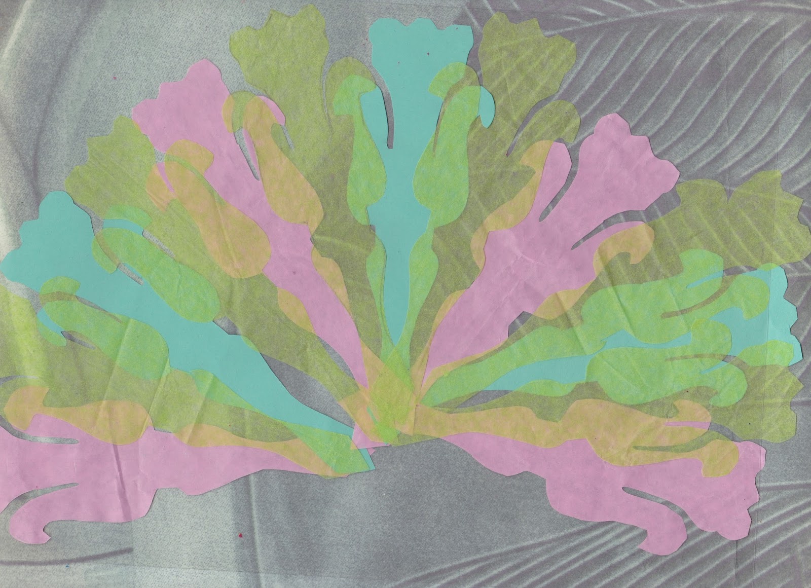
c)
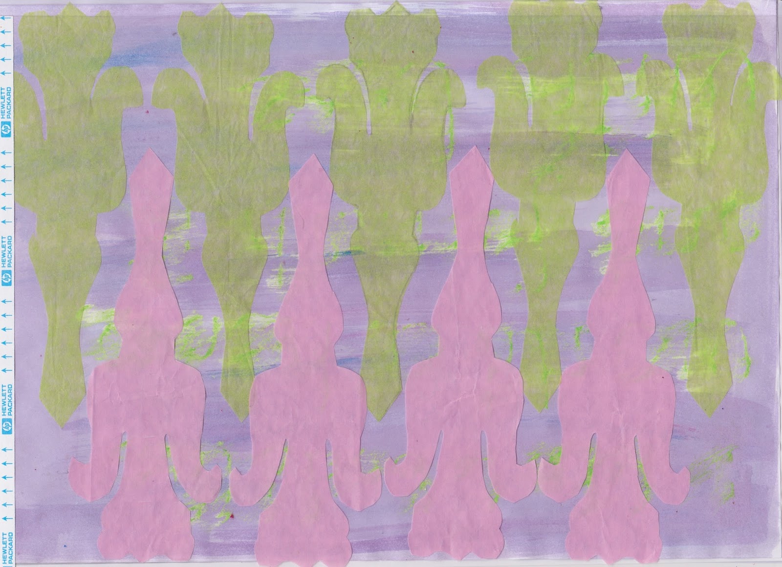
d)

This next one is my favourite, the pale tissue at the bottom is taken over by the bright pink background
e)

6.5.3. Fern
Using a grid. The original was a small fern growing out of the wall
a)


6.5.4. Barn
I took an outline of the barn, then used a section of it in a larger scale to use with it.

I thought using a purple marker pen might be more sympathetic than black.


I liked my first arrangement the best, so coloured it as below. Again I have used Inktense. One disadvantage is that sometimes there is more coloured pencil in one part of the drawing than another, which is more noticeable when it is gone over with water. It doesn't matter really, but what sometimes starts out as fairly gentle colours gets brighter and brighter.
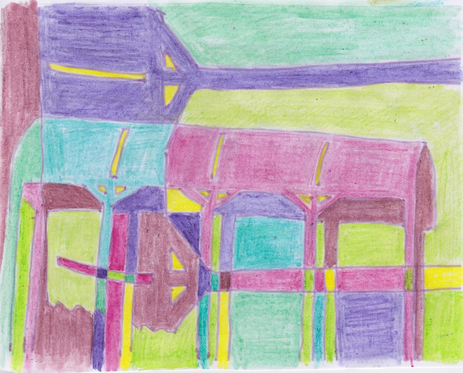
This variation is the one above, copied and then cut diagonally with the middle reversed.
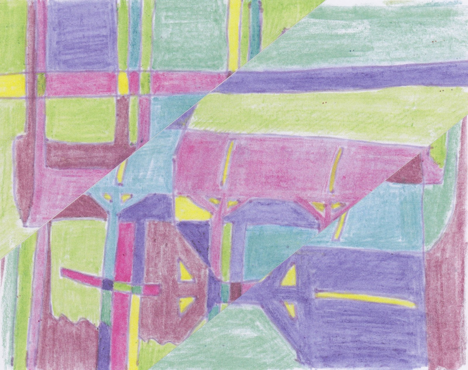
What a nice way to achieve an abstract composition. Again a very enjoyable chapter.
Friday, 19 July 2013
Module 6 - chapter 4
6.4.1. Taking a closer look
There are so many things on the farm that I like to draw, so I had to select something in particular and I decided on foxgloves.
A simple line drawing
a)


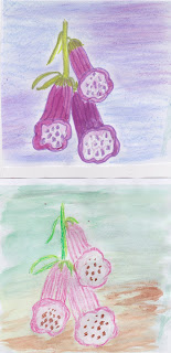

There are so many things on the farm that I like to draw, so I had to select something in particular and I decided on foxgloves.
A simple line drawing
a)
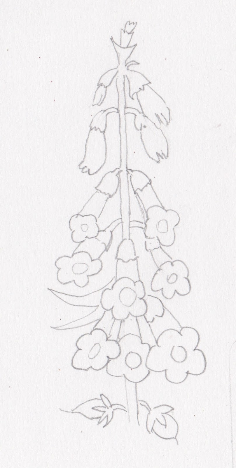
b) pattern, closer up, using my grid.

c ) Using the view finder, closer up still, with tone

d) Not very interesting leaf. I should have turned it round.

e) & f)
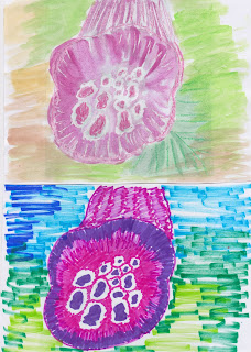
I thought it would be interesting to do more than one of each in different media, so the first is done with the flowers in oil pastel and the background Inktense. I found it quite liberating in a way to use oil pastels for this part as they are chunky and it isn't possible to be too 'fussy' with them. White was used and blended to make the paler parts. The second is just Inktense pencils and blocks.
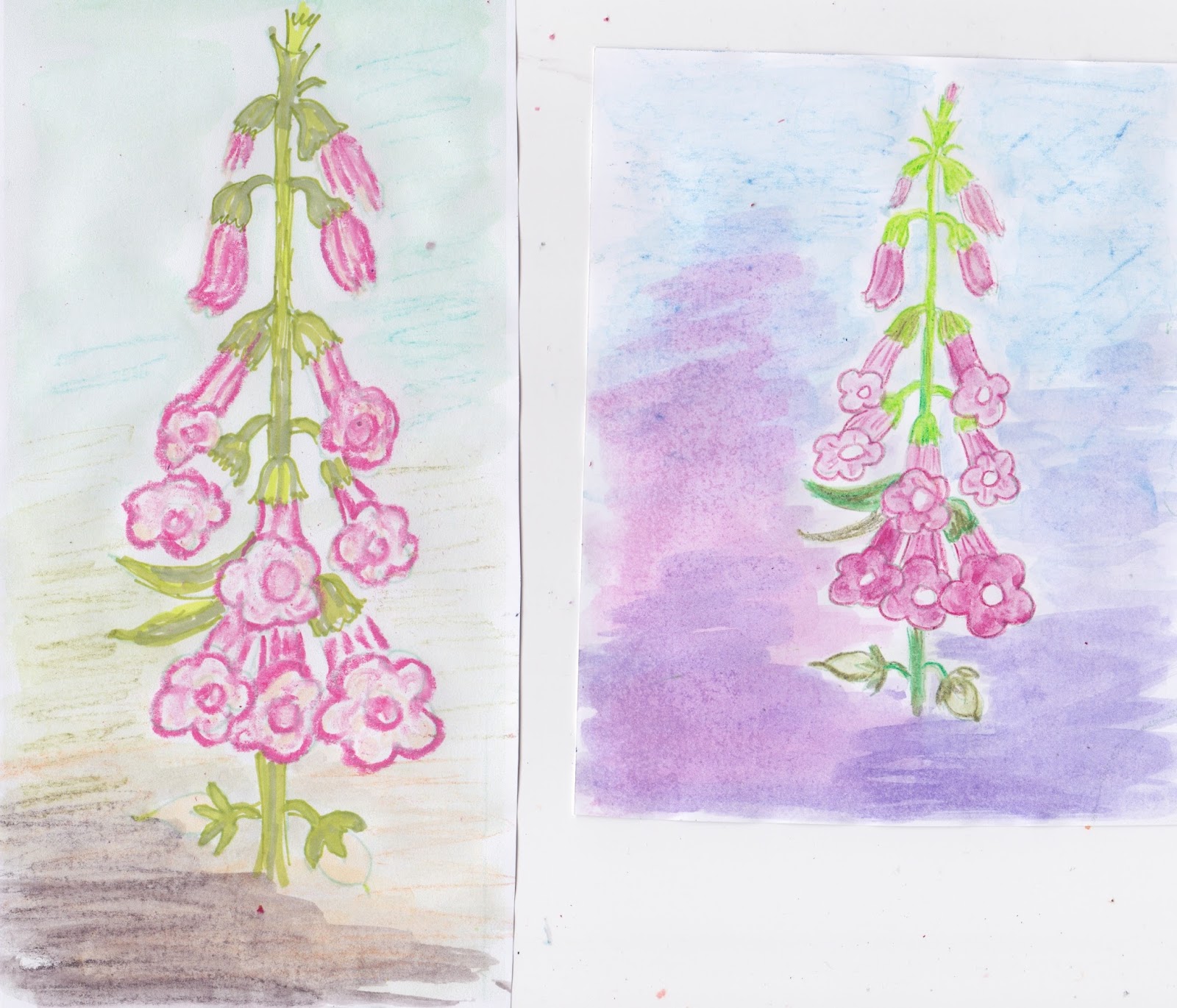
g) & h)
g) White oil pastel for a resist inside flowers. Pen and gouache for purple, Promarker for the green parts. Inktense blocks for background.
h) Oil pastel for flowers and stem, watercolour for background.

i) & j)
Once again i) is oil pastel and white is used as a resist. Background is gouache
j) is a bit scary isn't it? But just to experiment it is done in felt tip. Not really my style at all.

K) a leaf in Inktense.

This was a really interesting chapter because it has made me appreciate the advantages and pleasures of mixing different media. Also I shall be using oil pastel in the future now I have come to love it more.
Saturday, 29 June 2013
Module 6 - Chapter 3
Exploring theme in pen and ink
I have a very large collection of pens, so it is good to be able to put some of them to use in this chapter. I will keep these samples below safe as it will save lots of time in the future and also save upset as I will not 'wash' those that are not permanent.
Perhaps its not relevant but one artist I like very much is Eric Ravilious, of course most of his pictures are wood engravings and lithographs, but seem to have the same feel to them as pen and ink.
6.3.1 Mark making
I am sorry that the top line has got chopped off. It should read......
Scribble, Stabilo Write 4 all permanent ...Sharpie Fine point perm...Uniball gel grip
 .
.


I have a very large collection of pens, so it is good to be able to put some of them to use in this chapter. I will keep these samples below safe as it will save lots of time in the future and also save upset as I will not 'wash' those that are not permanent.
Perhaps its not relevant but one artist I like very much is Eric Ravilious, of course most of his pictures are wood engravings and lithographs, but seem to have the same feel to them as pen and ink.
6.3.1 Mark making
I am sorry that the top line has got chopped off. It should read......
Scribble, Stabilo Write 4 all permanent ...Sharpie Fine point perm...Uniball gel grip


6.3.2
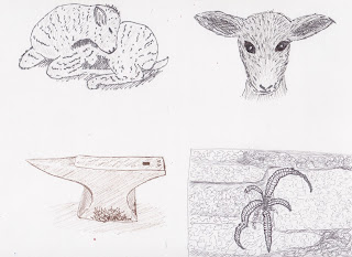
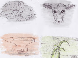
I thought I would start with part of a couple of the barns and I found it very useful to have done the above to help me decide which pens to use.

I was rather reluctant to put a wash on the original picture, even though of course the paper is a much better quality for a wash, so I have washed a photocopy. That means I still have the option of doing something different to the original.
Another barn, again as above but a very wishy washy wash.

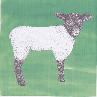
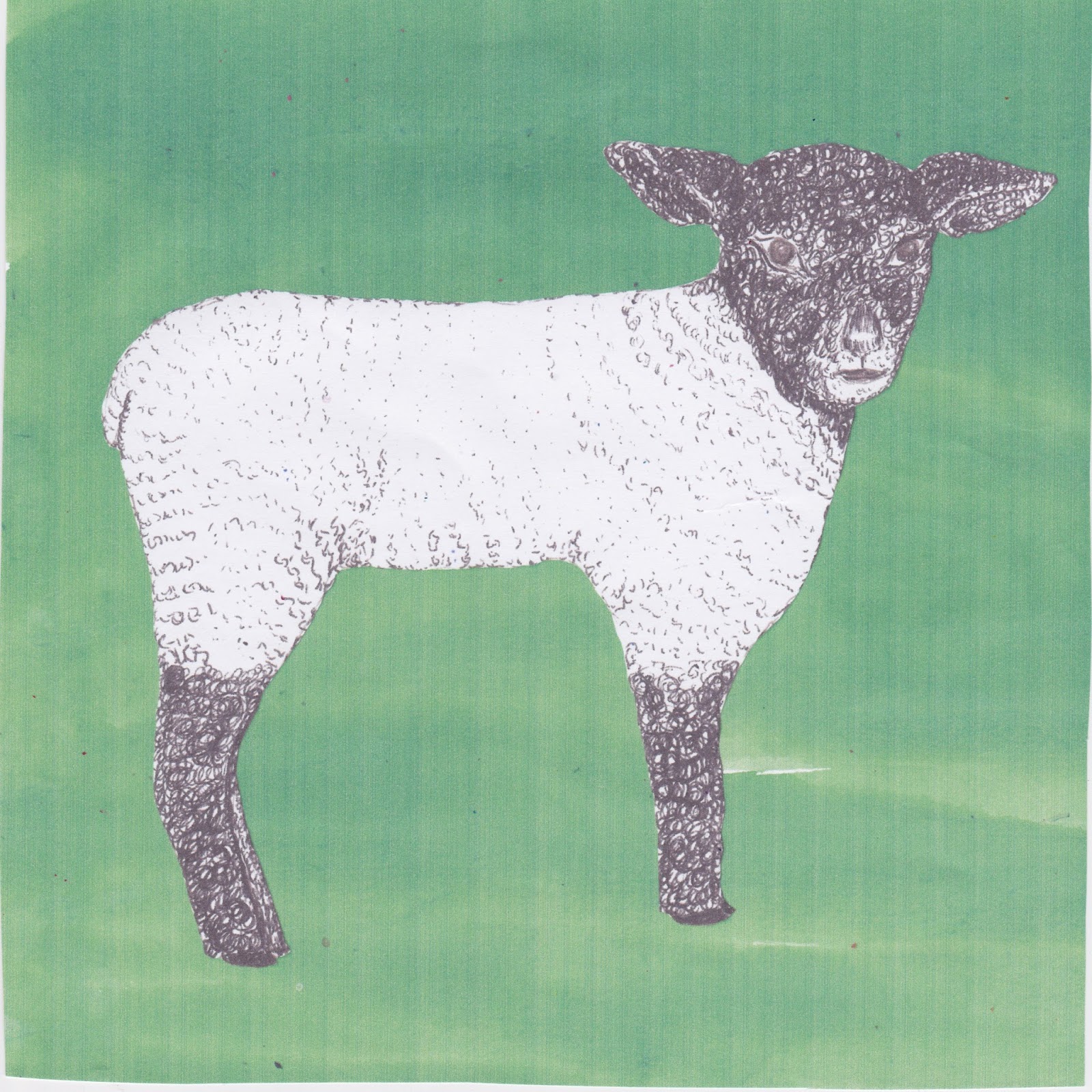
I quite surprised myself by finding that my preferred pen for this sheep was in fact biro. I have done him rather large but got a bit carried away.

I didn't want to colour him, so I put him on a painted background instead.
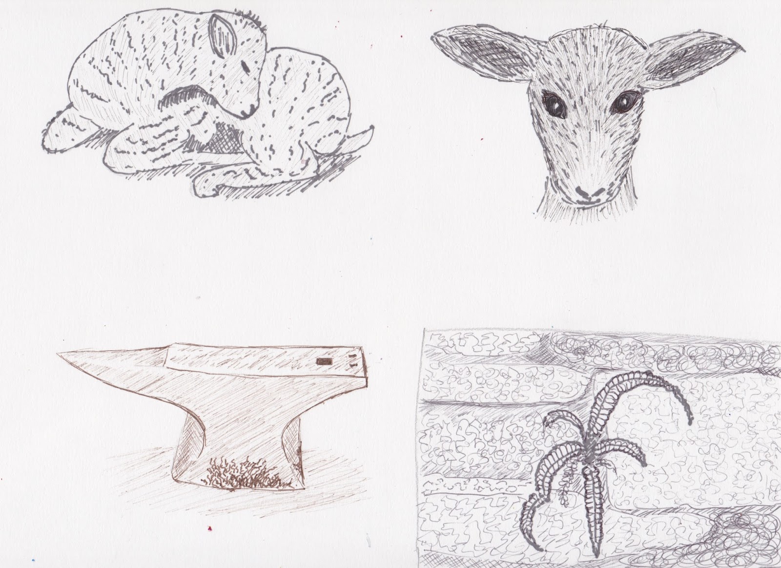
Oh dear, this next picture of a sheep's head is horrible, the poor thing looks possessed. I definitely prefer the anvil. The fern is one of many growing in the barn walls.
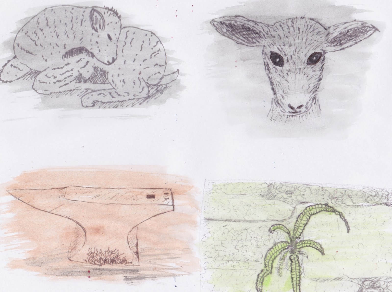
The wash would have been more relevant if I had put in background I now realise.
I am looking forward to doing more drawings around the farm now I have made a start.
We do get to see lots of the sheep here. Even though they don't belong to us, we still get involved. Last week we had to move about 100 from one field to another as a man was coming to spray the dock in their field. Using the 'Mule' - a small jeep, we rounded them up and got them into the next field without incident in about 5 minutes. However we were then asked by the man who owns them all if we could also move about 50 cows AND the bull. Again we managed very efficiently and thankfully the bull was the good tempered one, who obligingly walk in after the cows in his own time. Phew.
Friday, 21 June 2013
Module 6 - Chapter 2
Freestanding books
6.2.1. There is an unbelievable number of artists under the headings of hand made books etc. I have a few favourites and although her books don't pop up or out, I love the work of Frances Pickering. There is something peaceful and close to nature that I find delightful.
I have been collecting 'commercial' artist books for some time, but as usual they are all packed away somewhere. One that I do have to hand and part of a series is the cute little London by Sara McMenemy, part of a series of cities. It is three dimensional and has a cut out skyline, is double sided and has stand outs. They make lovely souvenirs.

6.2.2 Samples
I have some very good quality paper that I bought some long time ago that I could use for these samples. Although it takes more work to fold neatly, it does make a strong shape.
The first is just a very long zig-zag. I could sew signatures into this, cut the top to shape, stick flags etc. So the base part is very important.

The second is a star book. This is obviously rather limited, but can be very effective.

Another zig-zag or accordion fold book, this time with windows in various sizes cut out and pushed through to the other side. A hard covered board is stuck to each end with a ribbon slotted through before fixing one end to fasten the book.

The last one is a double slotted accordion book, again with covers as before

Just for fun I thought I would end with something I did in a 2 hour workshop at my favourite Contemporary Craft Fair, the one at Bovey Tracy. It was on paper cutting and this is one that turned out quite well.
 Mind out Sue Blackwell!
6.2.1. There is an unbelievable number of artists under the headings of hand made books etc. I have a few favourites and although her books don't pop up or out, I love the work of Frances Pickering. There is something peaceful and close to nature that I find delightful.
I have been collecting 'commercial' artist books for some time, but as usual they are all packed away somewhere. One that I do have to hand and part of a series is the cute little London by Sara McMenemy, part of a series of cities. It is three dimensional and has a cut out skyline, is double sided and has stand outs. They make lovely souvenirs.

For many years I made a point of collecting advertising give aways that come under the heading 'paper engineering. I have a brilliant one from Honda that just keeps unfolding in different directions.
6.2.2 Samples
I have some very good quality paper that I bought some long time ago that I could use for these samples. Although it takes more work to fold neatly, it does make a strong shape.
The first is just a very long zig-zag. I could sew signatures into this, cut the top to shape, stick flags etc. So the base part is very important.

The second is a star book. This is obviously rather limited, but can be very effective.

Another zig-zag or accordion fold book, this time with windows in various sizes cut out and pushed through to the other side. A hard covered board is stuck to each end with a ribbon slotted through before fixing one end to fasten the book.

The last one is a double slotted accordion book, again with covers as before

Just for fun I thought I would end with something I did in a 2 hour workshop at my favourite Contemporary Craft Fair, the one at Bovey Tracy. It was on paper cutting and this is one that turned out quite well.

Subscribe to:
Posts (Atom)