Thursday, 9 May 2013

Module 5 - Chapter 9


Crowds

5.9.1.
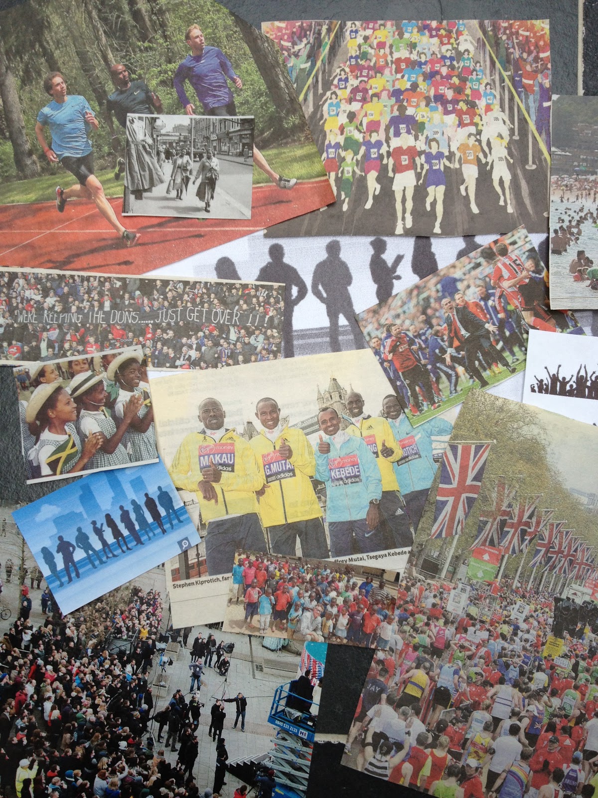
I made a large collection of crowds, many of which I decided were not suitable later when I thought about what I was going to do with them.
Stencils and templates
I got off to a bad start by selecting some runners. Having made the stencils and done a couple of pictures with them, I realised that the poses were too similar.
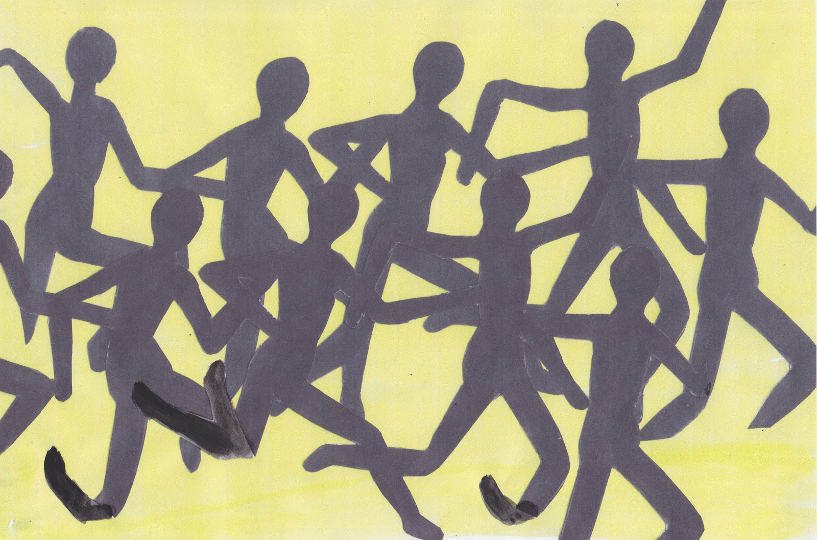
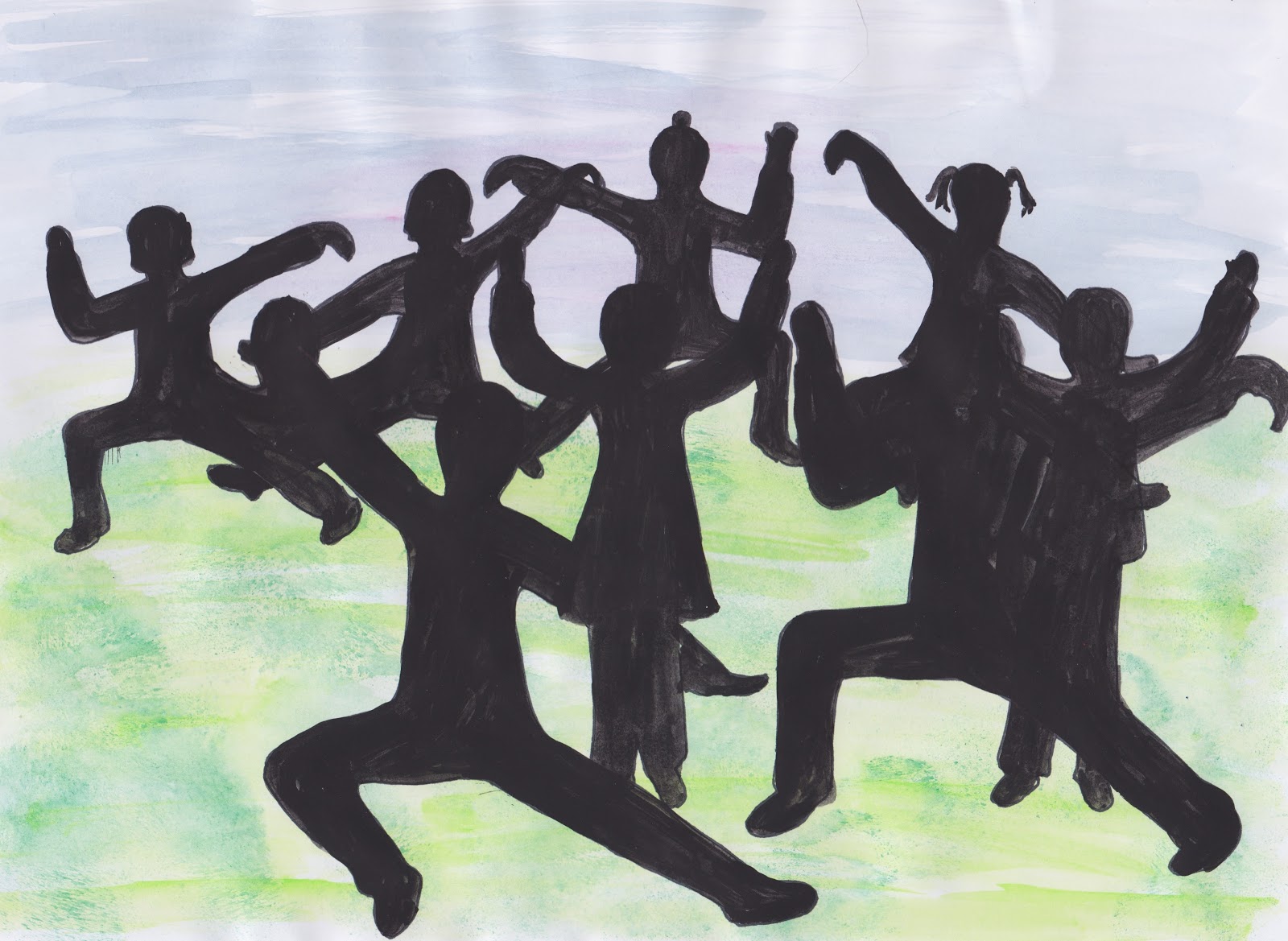
Back to the drawing board. But I still didn't find any figures I liked, so in the end I made up my own by going back to my articulated card figures and (since I did Tai Chi for some time and liked it) decided to use these poses.

This first one is done on a page from a newspaper that seemed appropriate with the background and the second with the  figures cut out of hand painted papers is done on a paper bag that I got when shopping in Hong Kong. I knew it would be useful one day
This green/blue one is done on a lightly collaged background, the next one painted background and the green background is a copy of a quilt back.

Monoprinting
This is the first time I have done monoprinting using many colours together on the same piece of paper by flipping it back and forth. I rather like the effect though I think the fabric paint used was a bit to runny in some of the colours. The blue topped lady looks like a turnip head.
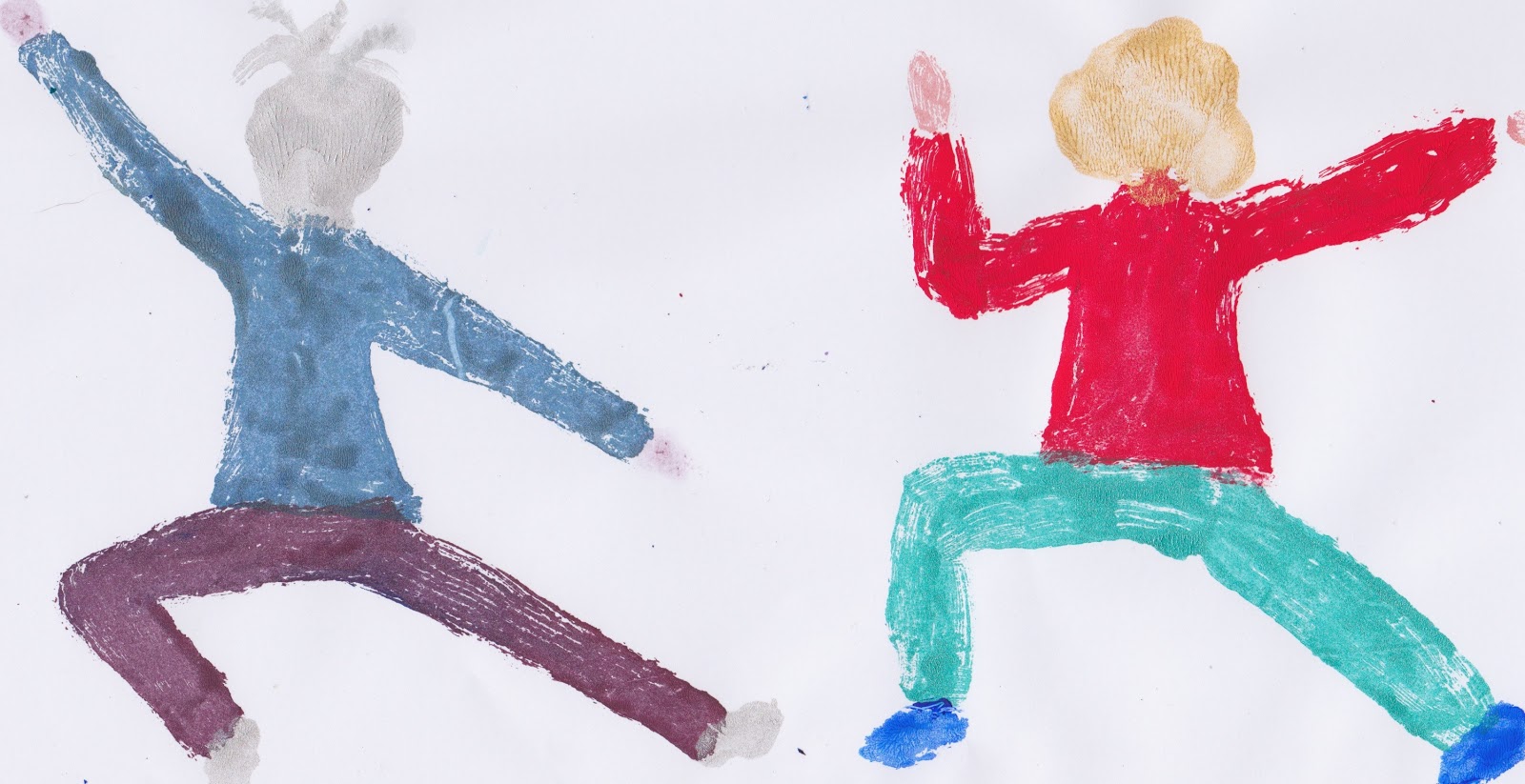
Well fabric paint is not too bad, but then when I went to acrylic things got much worse. I tried some Liquatex medium to thin down the acrylic, but it still started to dry so fast that I ended up with a very quickly done rather fat outline.
Next another mixture, but still no good
The previous week-end which was very hot, I had been trying and got a lot of rubbishy results, when I looked at the temperature in the conservatory it was 24 degrees!  Oh I will be pleased to have a room of my own - soon. However I have made a lot of notes on the various mixtures used so these will be useful in the future.  My folder is absolutely bulging with pages that  are failures, but it isn't a waste if I remember what went wrong.


A while ago I was using someone else's printing inks and although it is not relevant to this module, I thought I would add a couple of dry point pictures that I did then.
I have got some printing ink of my own, but the barn didn't want to give them up when I went searching this time.  I will find them and have another go at this monoprinting. Perhaps by then I might have a "place of my own" and a little of my sanity back.

Saturday, 20 April 2013

Module 5 - Chapter 8

CROWDS

5.8.1 Lowry

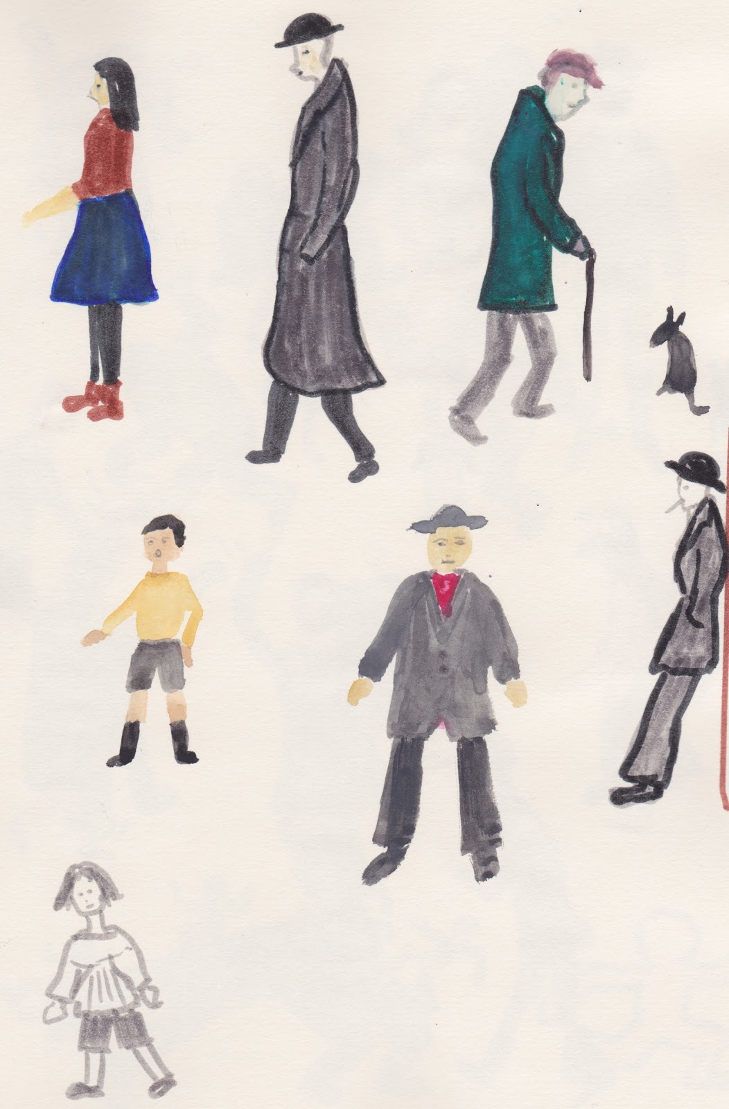
There is certainly lots to choose from when looking at pictures by Lowry. It is quite liberating doing figures without having an outline first and it is this perhaps that gives his figures such a feeling of being alive.
These pages are done in watercolour and I realise that some of the colours are a bit too bright. Some of his people have features and some not, so I have also done this.

I can't resist putting in the odd dog and cat.
5.8.2  Haring

I was very interested in Haring and read a brief biography.  He certainly did like to "make the most use of negative spaces" and apparently would spend a great deal of time working our how best to use it.

I find doing these very uplifting and got a real  sense of movement when drawing them.  I think I shall be using them quite a lot in the future.

I thought I would try black and white, using black paper. Unfortunately the white pencil I was using doesn't give a very good outline. I also tried a white gel type pen, but again it wasn't a very good one.
When I do find a good one I love the effect of using it on black paper.

This final one was great fun to do although some of the colours are not really "jelly baby" ones.

I shall of course keep the templates and resulting stencils I have made of the above, but I think I would be fairly happy to just dive in and draw these types of figures freehand.

In all this chapter has certainly loosened up my inhibitions about drawing figures and I thoroughly enjoyed doing it.

Saturday, 23 March 2013

Module 5 - chapter 7

Bodies & Movement

I enjoyed doing this chapter. The idea of dividing the body into 1/8ths makes it so much easier to work out what goes where.

5.7.1
"Somewhere in the Barn" I do have  an articulated figure, I expect I will find it again later this year! Meanwhile I enjoyed drawing the figure to scale.


5.7.2
I made two versions of the articulated figure. The first smaller one, I fastened together with linen thread.  It was really tricky to try and get the thread tight enough and neat.  The result was OK but quite floppy. The second version as fastened with small paper pins, or mini brads as our friends across the pond would say.


5.7.3.
My first thought about 'poses' was yoga, since I did it for 20 years. I should go back to it really.
 
It really annoys me that I still can't put things side by side.  Opps I did it, but it will probably go wrong when it gets to 'publish'

Next I used the smaller figure to get more onto a page and make the beginning of a crowd.

then, blacked them in, cut them out and reproduced them onto painted paper, reversing on the pink.
Then played again, by adding another lot on top. On the pink I think it would look very effective with a bonfire put between the black and white figures, to look like light shining on the latter.
Back to my larger figure, which is easier to draw around without it slipping so much. Figures cut out of magazine and pasted onto paper, gouache added afterwards.

Another lot, some just drawn in outline, and three drawn on stupidly thin tissue paper, coloured, cut out and stuck on top of the drawn figures. Powdered Inktense rubbed over tissue to give more texture.


Finally another play with Picasa


Wednesday, 13 March 2013

Module 5 - Chapter 6

CHANGING FACES

5.6.1.
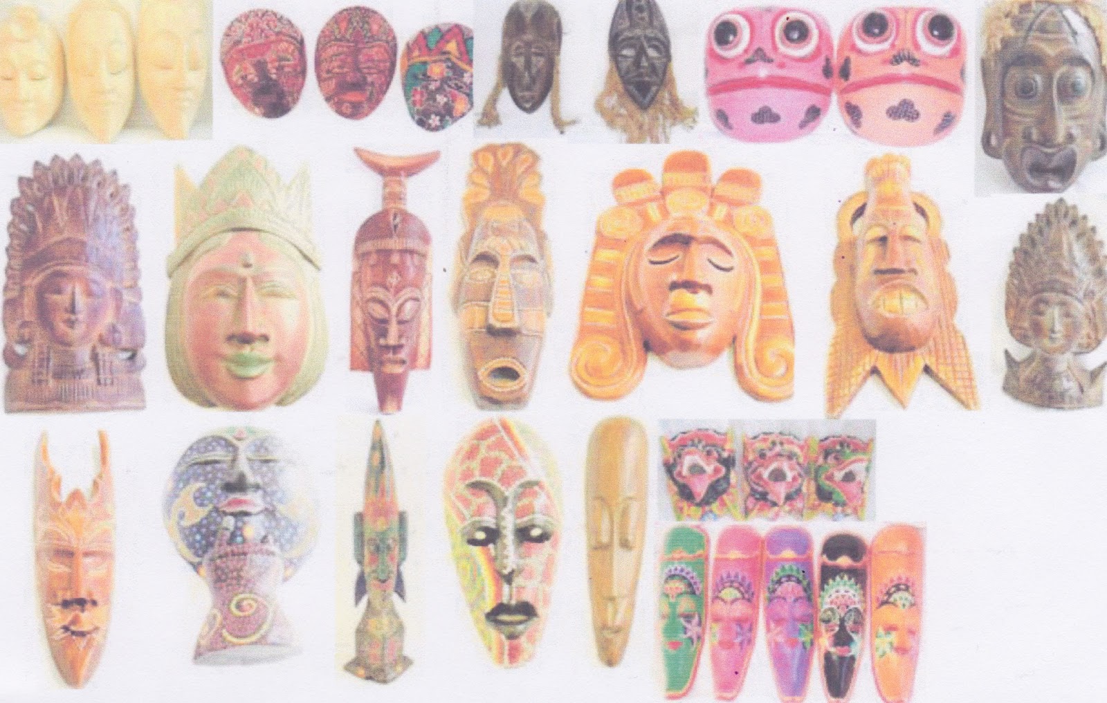
Rather than putting loads of pictures on here of masks from around the world, I thought I would just show some from St Lucia and one rather topical one. The rest can go straight in the file.


Quick sketches of some of the rest of them


5.6.2.
I chose two very different masks to draw. With the Maori one I drew half and folded it to copy the second half. The African one is drawn in fine black pen.


Section of both and the African one in different colours. It is interesting how the red/blue one looks completely different as the red is more dominant and changes the pattern.


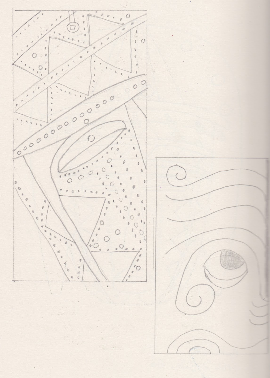
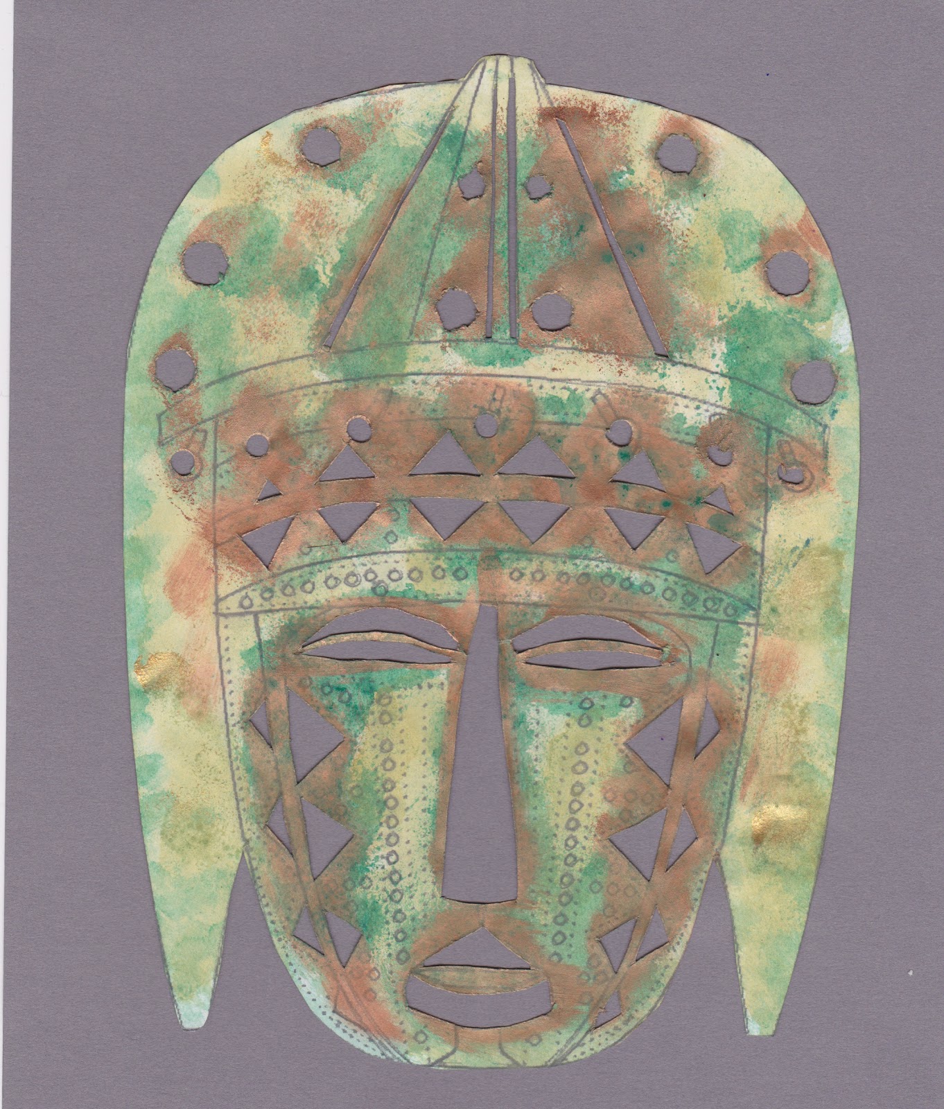
and other variations, done with stencils, sponged, painted etc. I used acrylic first on the first one with gouache over the top


This time I chose to make my file out of something different. First idea, I had a very large paper sack that had had bird food in it.  I cut up apart, separated the three layers and then decided it was just too big and wrinkly! Next attempt was to use some old manilla files that were going to be thrown away. The old sizes are quite large enough to be turned up at the bottom for a pocket and still take A4 and smaller sheets, stencils, sketches and so on. The outside is masks on painted paper and it is strung together with gold paper raffia, which seemed appropriate.


It is certainly a very sturdy file and will last for a long time.


Sunday, 24 February 2013

Module 5 - Chapter 5


Colourful faces

5.5.1 Adding colour

I decided to use gouache for this exercise and did manage to feed a heavier weight of paper through the copier. This time I was working in the conservatory, so a very good light, but couldn't discern much in the way of extra colour on my usual pale face.  Perhaps I was expecting to see some colours that van Gough might have seen.


EA Playing with Picasa

This is something I do a lot especially with the grandson aged 5.


Where has picture 4 gone? Heaven knows, but it has completely disappeared.


5.5.2.
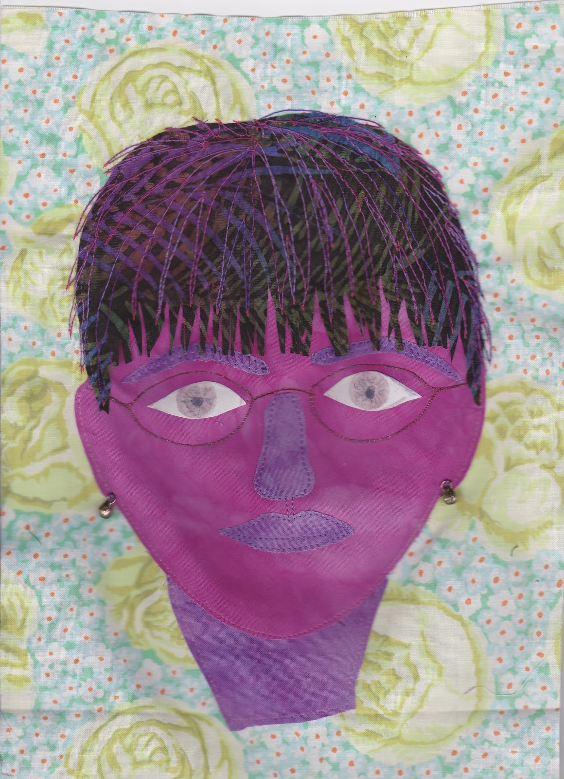
I thought I would like to do this exercise in fabric.  I couldn't face going off to the barn, fighting to unlock it (whilst standing on a chair) and then rummage for my Bondaweb, so I used lots of spray starch on the fabric.  The neck started off more normal than this, but I accidentally  cut bits off it for the eyebrows etc.


I must have been an old woman for the last 15 years as I love wearing purple, but not usually on my face. I haven't got around to running a walking stick along the railings yet, but give it a few more years. I enjoyed this exercise and it will give me the confidence to do it again.


Friday, 8 February 2013

Module 5 - Chapter 4


Your own face

5.4.1.
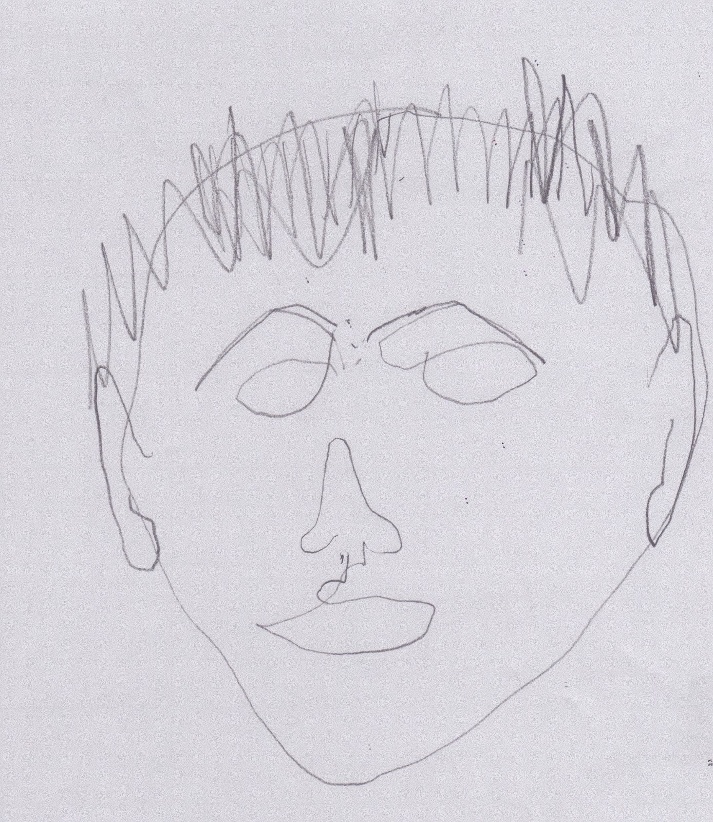
I used a soft sketching pencil for the following, but in case they are not dark enough to see very well, I then photocopied on the darkest setting and scanned. I didn't see that the examples had open eyes and since mine were shut, that is the way they have been drawn.


5.4.2
Well after the above, anything has got to be an improvement. This was drawn more heavily, so hopefully shows up better.

5.4.3
I did this one on a large square piece of good quality paper, so that if I can't get thicker paper to go through the copier for the next chapter, then I can use the original. I took a copy on ordinary copier paper though to keep.

Well it was very interesting to do, but I don't think this would pass muster for an identikit picture.

Tuesday, 5 February 2013

Module 5 - Chapter 3

Artists Self Portraits

5.3.1

My local library was not very helpful but found lots of self portraits on the internet. Having read up on some of them in more detail I printed off notes to keep with my selection, for future reference.


Of course I knew from the beginning I would go for Vincent van Gogh, but which one, as there are so many. I have loved this artist since my teens and have an excellent book and a few very good prints of his work "somewhere in the barn"! I chose this one done in 1887-1888 with its strong and controlled variation in brushstroke.


I found an article by Margaret Drabble from The Guardian, Saturday 5th December 2009 which sums up all that I feel for this lovely, brave and talented man. I have a copy with my notes.