Wednesday, 13 March 2013

Module 5 - Chapter 6

CHANGING FACES

5.6.1.
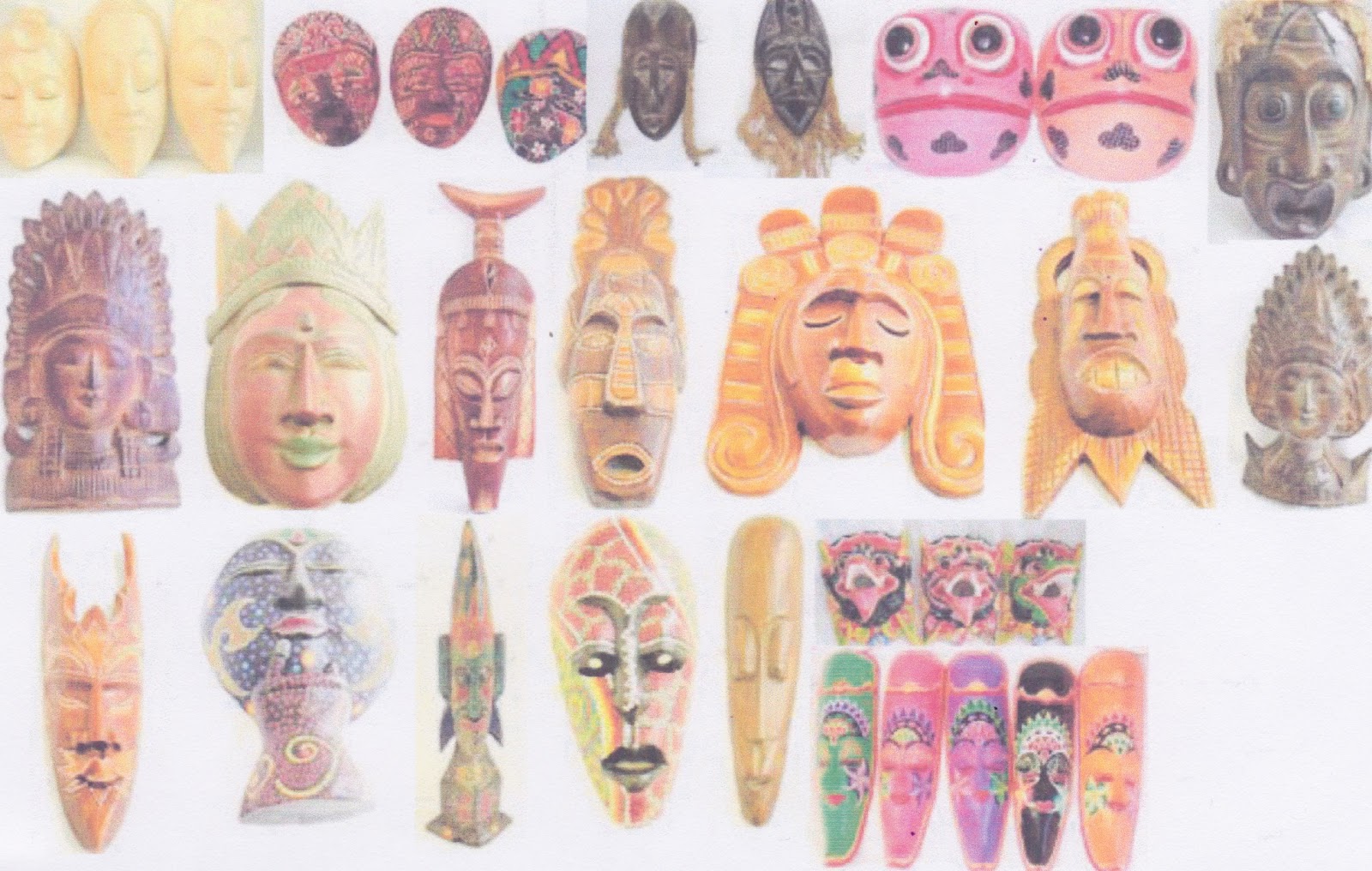
Rather than putting loads of pictures on here of masks from around the world, I thought I would just show some from St Lucia and one rather topical one. The rest can go straight in the file.


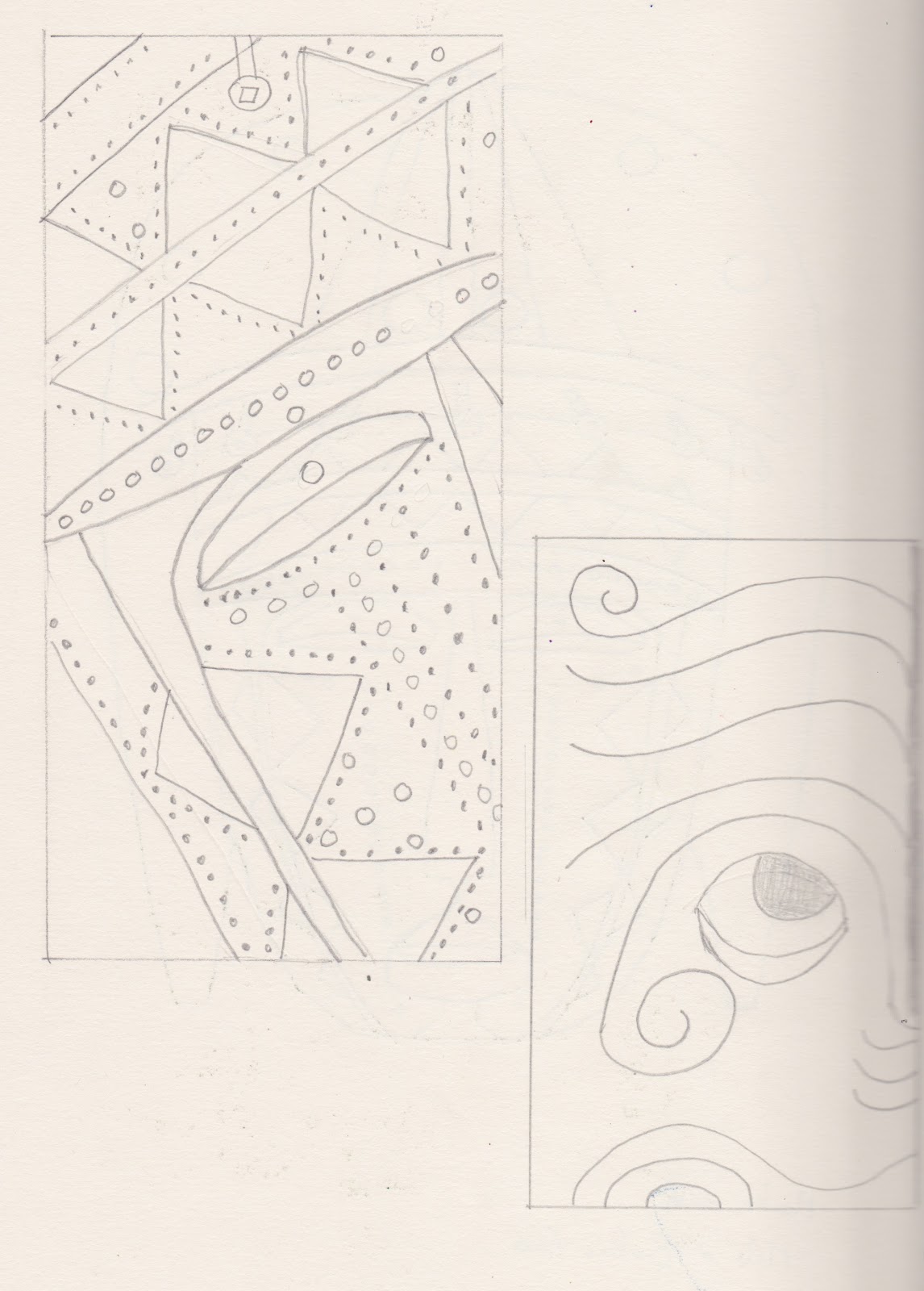
Quick sketches of some of the rest of them


5.6.2.
I chose two very different masks to draw. With the Maori one I drew half and folded it to copy the second half. The African one is drawn in fine black pen.


Section of both and the African one in different colours. It is interesting how the red/blue one looks completely different as the red is more dominant and changes the pattern.


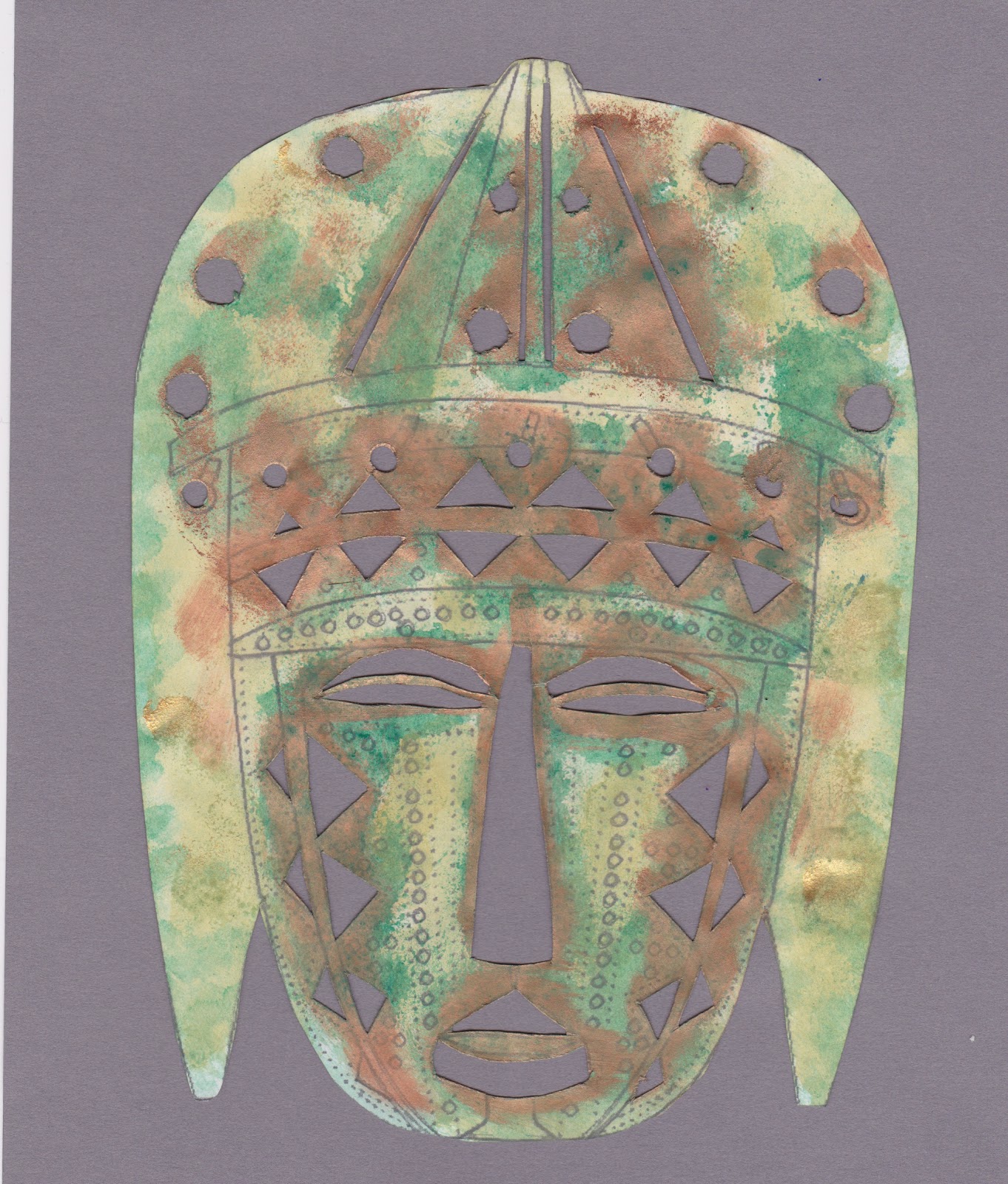
and other variations, done with stencils, sponged, painted etc. I used acrylic first on the first one with gouache over the top


This time I chose to make my file out of something different. First idea, I had a very large paper sack that had had bird food in it.  I cut up apart, separated the three layers and then decided it was just too big and wrinkly! Next attempt was to use some old manilla files that were going to be thrown away. The old sizes are quite large enough to be turned up at the bottom for a pocket and still take A4 and smaller sheets, stencils, sketches and so on. The outside is masks on painted paper and it is strung together with gold paper raffia, which seemed appropriate.


It is certainly a very sturdy file and will last for a long time.


Sunday, 24 February 2013

Module 5 - Chapter 5


Colourful faces

5.5.1 Adding colour

I decided to use gouache for this exercise and did manage to feed a heavier weight of paper through the copier. This time I was working in the conservatory, so a very good light, but couldn't discern much in the way of extra colour on my usual pale face.  Perhaps I was expecting to see some colours that van Gough might have seen.


EA Playing with Picasa

This is something I do a lot especially with the grandson aged 5.


Where has picture 4 gone? Heaven knows, but it has completely disappeared.


5.5.2.
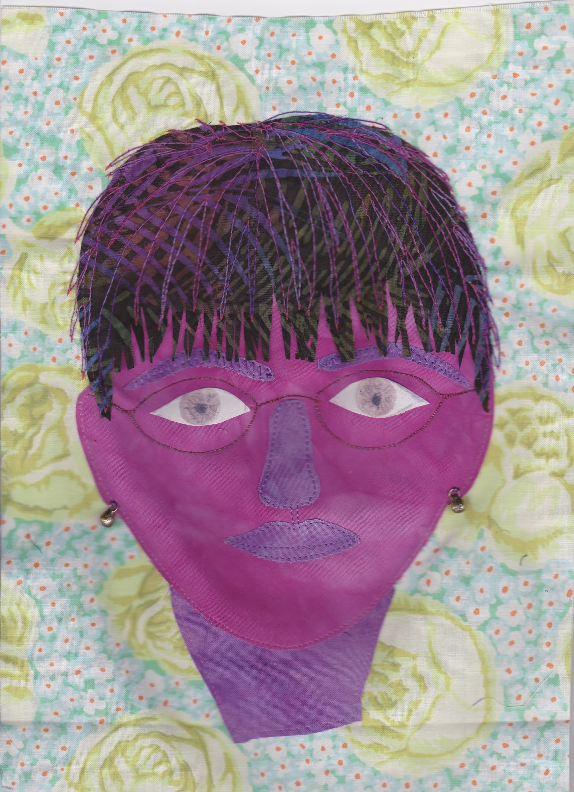
I thought I would like to do this exercise in fabric.  I couldn't face going off to the barn, fighting to unlock it (whilst standing on a chair) and then rummage for my Bondaweb, so I used lots of spray starch on the fabric.  The neck started off more normal than this, but I accidentally  cut bits off it for the eyebrows etc.


I must have been an old woman for the last 15 years as I love wearing purple, but not usually on my face. I haven't got around to running a walking stick along the railings yet, but give it a few more years. I enjoyed this exercise and it will give me the confidence to do it again.


Friday, 8 February 2013

Module 5 - Chapter 4


Your own face

5.4.1.
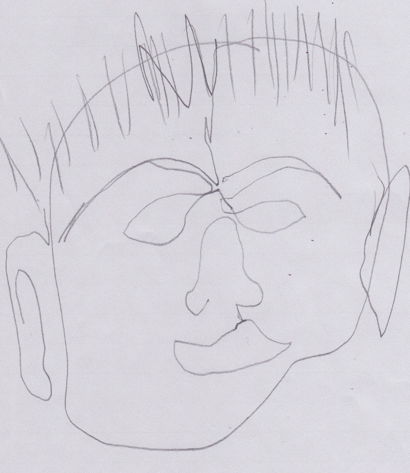
I used a soft sketching pencil for the following, but in case they are not dark enough to see very well, I then photocopied on the darkest setting and scanned. I didn't see that the examples had open eyes and since mine were shut, that is the way they have been drawn.


5.4.2
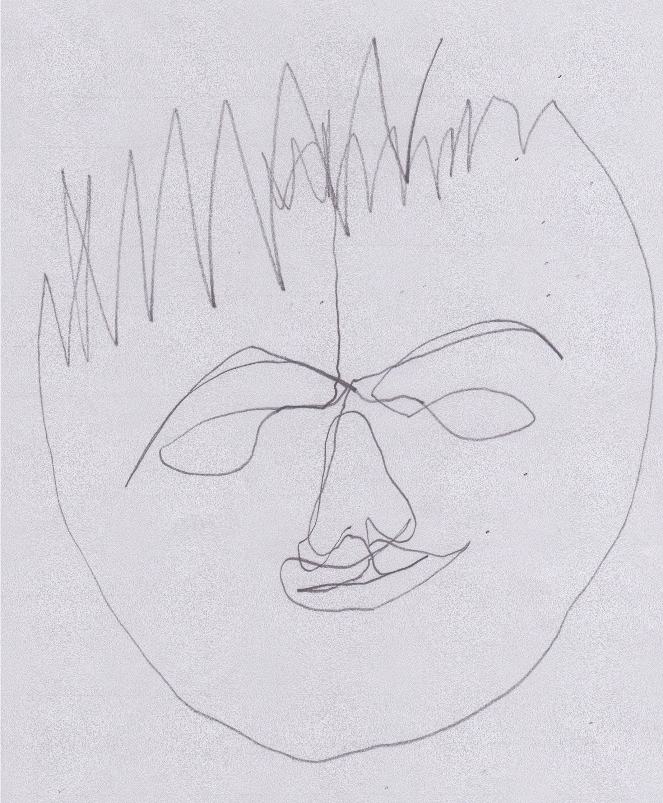
Well after the above, anything has got to be an improvement. This was drawn more heavily, so hopefully shows up better.

5.4.3
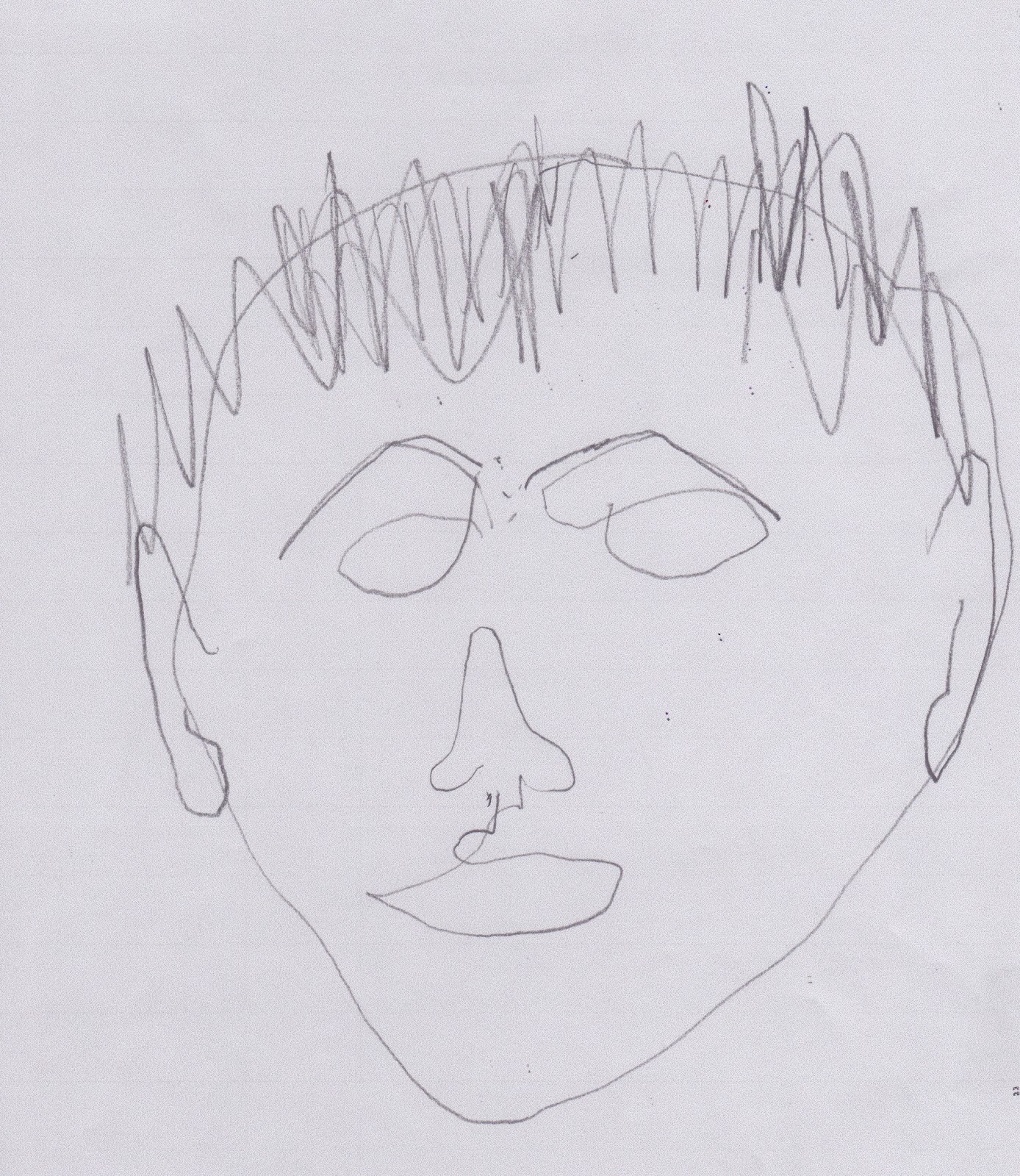
I did this one on a large square piece of good quality paper, so that if I can't get thicker paper to go through the copier for the next chapter, then I can use the original. I took a copy on ordinary copier paper though to keep.

Well it was very interesting to do, but I don't think this would pass muster for an identikit picture.

Tuesday, 5 February 2013

Module 5 - Chapter 3

Artists Self Portraits

5.3.1

My local library was not very helpful but found lots of self portraits on the internet. Having read up on some of them in more detail I printed off notes to keep with my selection, for future reference.


Of course I knew from the beginning I would go for Vincent van Gogh, but which one, as there are so many. I have loved this artist since my teens and have an excellent book and a few very good prints of his work "somewhere in the barn"! I chose this one done in 1887-1888 with its strong and controlled variation in brushstroke.


I found an article by Margaret Drabble from The Guardian, Saturday 5th December 2009 which sums up all that I feel for this lovely, brave and talented man. I have a copy with my notes.

Wednesday, 9 January 2013

Module 5 - Chapter 2


Hands and Eyes

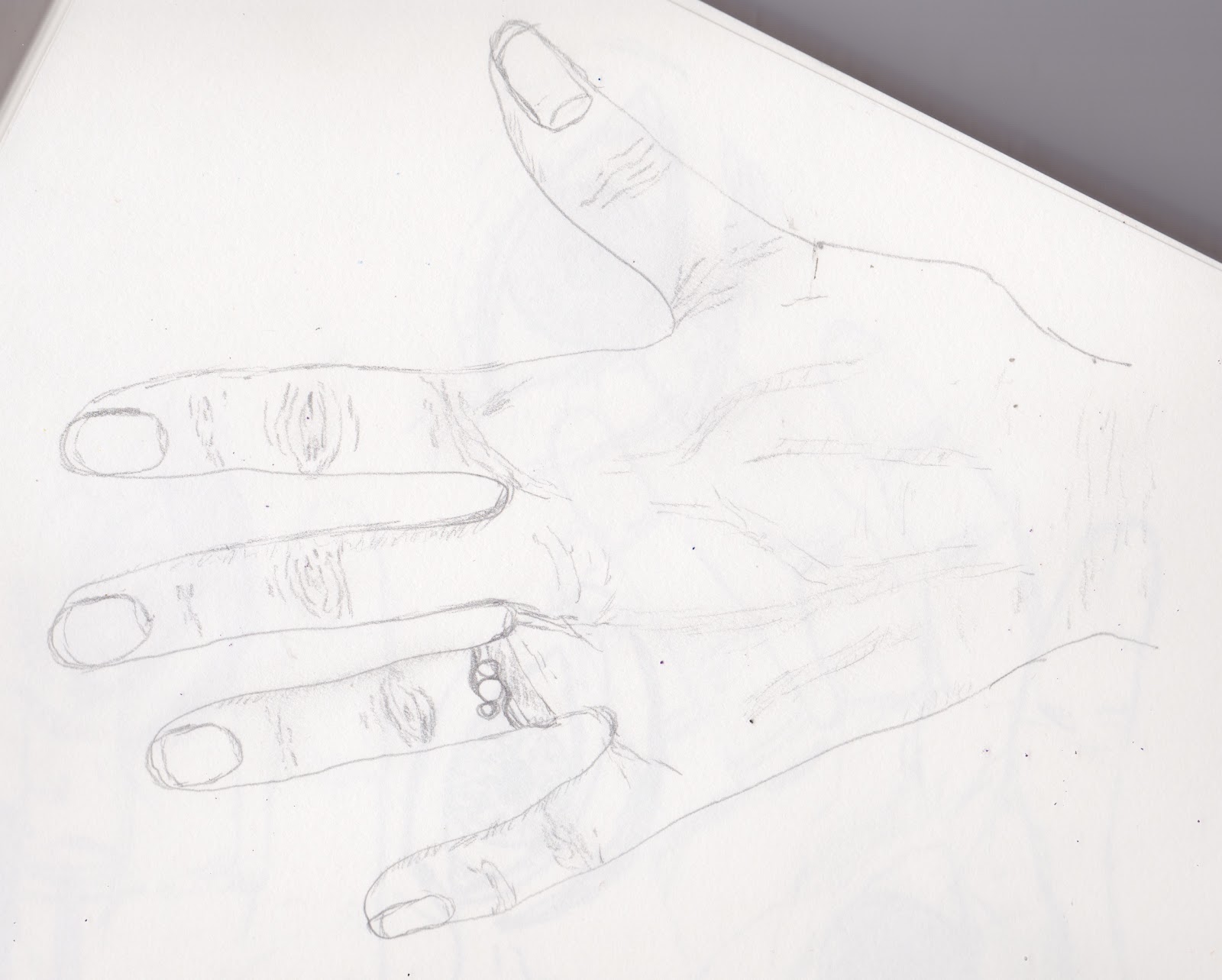
5.2.1.  What an excellent way to begin hand drawing, going around ones own just as we used to do when we were young. However not being young I got a bit too engrossed in veins etc.


I enjoyed doing the next four as well. All done with ordinary B sketching pencil


I think I am out of practice at loading pictures, they are going all over the place today.

5.2.3

For my design I used Markel oil sticks over a cut out of my hand. It was very noticeable that the Professional oil sticks (brown) are softer than the Student ones (green). The next day I gave it a wash over with ochre gouache.  I intended to use water colour, but couldn't lay my hands on them - again.


5.2.4
I know my eyes are deep set, but I am not sure that I have depicted this well enough in my drawings.


It is good to be back on track again, even if we are only half back in the house and I still have to trudge out to the barn for some of my materials.

Thursday, 29 November 2012

MODULE 5 - Figure and Form

Chapter 1 - Making a folder

It has been such a long time since I last posted anything, but we are still not back in the house, well we have the use of the kitchen but that is it and it is really hard work going out to a barn and rummaging about to find cord etc. Still we are getting there and hopefully will have some rooms ready for Christmas when we have family coming!

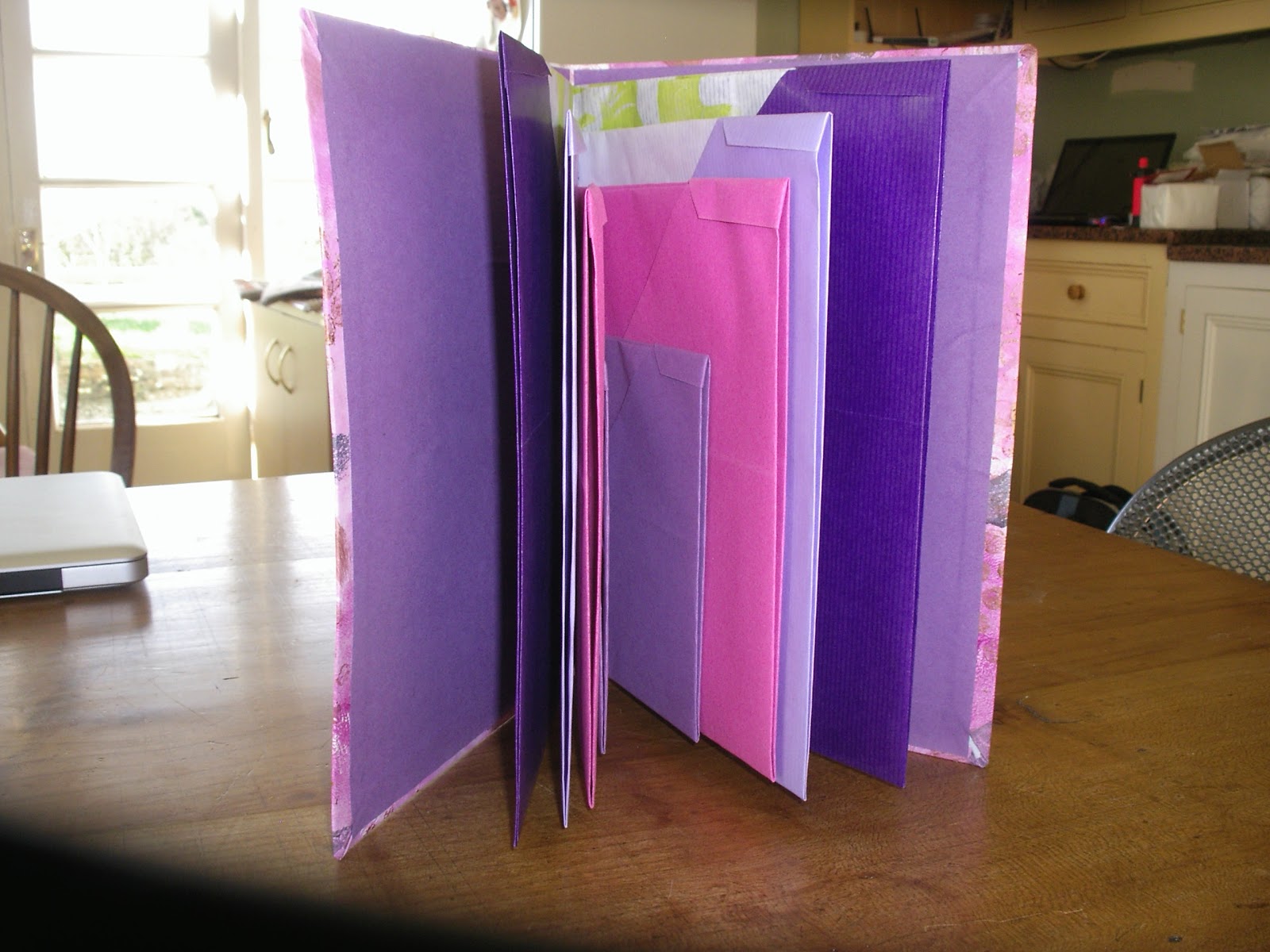
I liked the idea of most of the folders but because I love origami I settled on that one for my folder which is a bit over A5 size. These as predicted are fun to make.
Here are some of the sheets, two of which are coloured kraft paper with some painted decoration on the white side and the smaller ones are sugar paper.  Although my top corners are not tiny triangles I decided I liked them anyway.


The paper for the cover is painted using acrylics, bubble wrap, collaged paper, printed tea bags and a home made hand block. It is wrapped over a piece of cereal packet on the front cover and card from a pad on the back. The inside is covered in sugar paper.
I'm so sorry I have just realised I haven't cropped these, but if I stop heaven knows when I will get back.

The holes were made with my very useful Japanese hole punch and threaded with thickish purple cord.


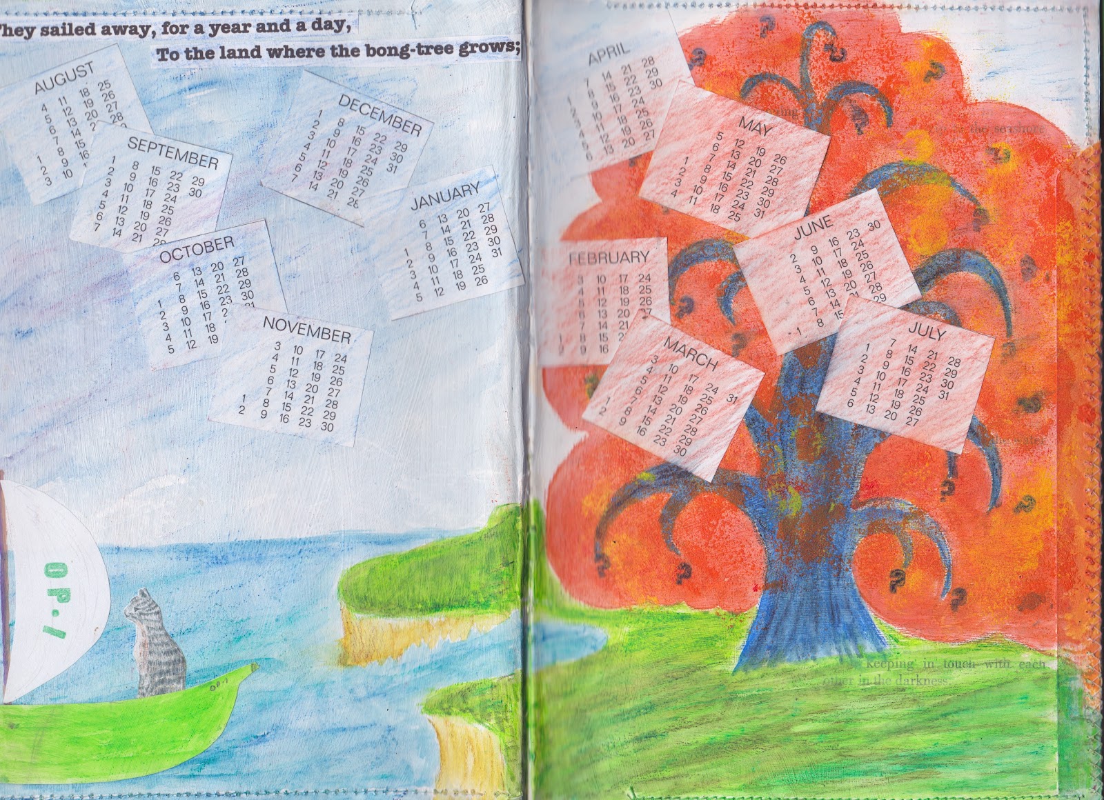
For fun I made a few others, but just showing this one, made from an old Molly Makes calendar which has interesting pages.


 The scanner is refusing to work today hence all photos. Mine you with all the dust in everything it isn't surprising, I know how it feels.

Anyway the next chapter of drawing shouldn't require much searching for materials so I will try and get on with that.


Monday, 10 September 2012

Module 4 - chapter 10

Altering a book

The original book was about birds in the USA.  I removed about half of all the pages and stitched the remainder in pairs. the subject was opportune as some phrases were apt for my story.

I will start off with the cover which in fact I did last. It is not as I hoped but I have run out of time as the house is being demolished around our ears and I wanted to get it finally done. I would like to make a new cover some time in the future, perhaps out of textiles to slip over this one.

The gesso has been coloured with Inktense, the Owl & Cat applied and then coated with acrylic wax. This was not a good idea as the applied paper then began to run and messed up the colour. Also I wouldn't have done the title as I have, given more time.


Almost the whole of the book is coloured in Inktense pencils and blocks. The pages for the end papers were first coloured then a diamond grid pencilled on. The owl is a commercial stamp but I made the stamp for the cat from fab foam and extremely fiddly it was too.


In retrospect I perhaps didn't need these two pages but decided to put in the title on one page and some information on a hand made luggage tag on the other. The reverse of the tag says 'The Owl and the Pussy Cat written by Edward Lear in 1867. Illustrations by Janet Gent 2012.  It is fastened by a brad through some hand dyed cotton ribbon so it can be turned over.  The silky thread  on bottom left hand side of the page was hand stitched and then of course the colours went through onto the next page.


I had intended to keep the stitches white on both pages but it didn't matter.  The start of this whole idea was the thought of doing the story of them going off in a green pea boat not the other (correct) way around. As with most pages the pictures are collaged onto the background. The sun was intended to be stamped through to the yellow on the previous page, but it was just too thick.


I had to use the reverse of the stitches from the previous page so this time they turn into the flight pattern of honey bees. The honey was a photo I took of a lovely tin of French honey I bought ages ago. I wanted to make the coins so used card circles covered with chocolate money foil, so not entirely round. I love the colours on these pages and the way the pencil over the rough gesso gives extra texture. I enjoyed lightly touching the machine stitching on the edge of the pages with Treasure Gold.


Oh I know it is corny but I couldn't resist making the owl with a beak that opens and closes with the movement of the page and the outspread wing is loose and flaps to and fro.


I was just so lucky that I could get the word 'dawn' into the sunrise here. I very much enjoyed looking for various words and phrases throughout the book that could be left peeping through the colour.


Hmm what does a Bong tree look like? It took days to come up with this answer and I decided there could well be more than one, so made the first fold out into a second tree with free machining for extra texture.


The first Piggy page has the reverse fold out of the Bong tree on the left and three extra fold outs on the right. These trees are the ones that gave me so much grief in July trying to work out how to make them look light enough. I made the stamp for the tree from Fab Foam again and didn't back it with any card. This meant it was floppy enough to also use individual branches as well as whole trees. First I did the background, then trunks and branches then more greenery.  The tiny birds were cut from wrapping paper to brighten the trees up a bit. There is a tiny extra touch of gold on parts of the trees.


This triple fold extension now goes to the left of the next page


In some ways I think this is my favourite page. The bride look so pleased with herself, perhaps it is the real owl feather in her lace headdress. The owl and turkey wanted a lace buttonhole too.


After all my previous experimenting with quince stencils and masks the following double page has ended up quite low key. The mince is 3D crumpled tissue and the pieces of quince on the plate are separate slices only fastened in the middle so they stand up on the plate. The runcible spoon was about the fourth edition I tried. It is metal tape on foam with square sequins, a scrap of Angelina and some gold cord.

The final page consists of three separate pieces of pop ups. These are a direct result of the Paul Johnson books that I have bought and got from the library. Getting the angles on the second and third sheet was quite a game. I liked the idea of the extra stand ups that can be added to the main pieces and made several clumps of grass as well as the sand castles, though they are not so easily seen.  The moon (which is a semi circle though doesn't quite look it) was coloured with Markle silver and opalescent. I found myself seriously thinking 'now what does a dancing cat look like?' Perhaps I have spent too much time on this book!


Altogether a thoroughly enjoyable exercise. I had the luxury of being able to indulge in spending lots of time on it and it took my mind off the ever worsening building works.