Raising the Surface
On the top of this first sheet I have taken Viv's idea and used my tracing wheel. It had also sat unused for about 35 years! The first square is done in wavy lines in two directions and the second in only one direction. I used a piece of foam underneath, but think that felt would have been better as suggested. The bottom two are cut out and partially stuck down stars and cut Vs of various sizes. I very much like the latter and have done many variations in the past.
The second page, top l.h. corner, cut and partially folded back. Top r.h. corner, probably a bit too subtle to show up but it is corrugated finely in both directions and looks a bit like damask. Bottom l.h. various size holes punched with an old dental instrument (I think used for tightening braces?) An interesting effect, but the throat is not very wide, so limited to edges. r.h. creased and stitched.
Third page top, split plastic straws woven through slits. Very bouncy. Middle commercial punch of cats cut out and stuck back slightly offset. Bottom black and white strips woven with thick punched dots glued to the squares. Quite fiddly. The thickness was supposed to cast a shadow, but it doesn't show.
I am a fan of origami, from way back when I used to look forward to my Rupert Bear annual with a new thing to make (with my mother's help) and I think some of the above is related to that. Anyway very enjoyable.
Tuesday, 3 July 2012
Tuesday, 26 June 2012
Module 4 - Chapter 5
Drawing with colour
It was great to get out my Derwent Aquatone and Caran D'Ache Prismalo pencils again. This is a medium I have neglected in the past year and having used them again I to appreciate their potential more. In fact I saw a friend using them on fabric at the week end to great effect. The Inktense is the only colour I have in this range, but my they are intense aren't they.
The first page is revisiting my peas that I did in module 3. I think the colours look a bit paler when scanned than on the page. I have taken liberties with the shadow colour under the peas.
I found it a little tricky not to blend the colours too much on the cat, so had to use the brush fairly dry. I also resorted to stroking a damp brush on the stick and then using it.
I used to take some of these with me if I was out at the beach for the day or somewhere with a chance to sit for a while, I will have to try and get back to doing that. I enjoyed this exercise very much.
It was great to get out my Derwent Aquatone and Caran D'Ache Prismalo pencils again. This is a medium I have neglected in the past year and having used them again I to appreciate their potential more. In fact I saw a friend using them on fabric at the week end to great effect. The Inktense is the only colour I have in this range, but my they are intense aren't they.
The first page is revisiting my peas that I did in module 3. I think the colours look a bit paler when scanned than on the page. I have taken liberties with the shadow colour under the peas.
I found it a little tricky not to blend the colours too much on the cat, so had to use the brush fairly dry. I also resorted to stroking a damp brush on the stick and then using it.
I used to take some of these with me if I was out at the beach for the day or somewhere with a chance to sit for a while, I will have to try and get back to doing that. I enjoyed this exercise very much.
Thursday, 21 June 2012
Module 4 Chapter 4
Sgraffito
4.4.1
I started off with Crayola glitter crayons as I couldn't lay my hands on the ordinary ones. They are done on slightly shiny card and painted over with black gouache. For some reason they look as though there is no colour under them although I thought it was quite bright.
The larger tree is done with ordinary Crayola chunky ones (eventually found) and the colours again were supposed to be bright but appear quite muted.
The next picture of the sailing boat was done with Neo oil pastels and this time painted over with dark blue, it is done on paper which although I thought it was smooth, perhaps wasn't smooth enough. I'm not at all pleased with it. I did another again on paper with paler paint on top which was so horrible it is in the bin.
Back to fat crayons and my slightly shiny card. The colours are weird for a cat, but at least I like him better and the pear is sort of OK. But all of them even though they have been left for ages are dirty to handle, both paper and card with the paint coming off. Is this normal and do they have to be fixed?
I quite liked the medium by the time I had finished but it is a pest if it has to be coated afterwards.
4.4.1
I started off with Crayola glitter crayons as I couldn't lay my hands on the ordinary ones. They are done on slightly shiny card and painted over with black gouache. For some reason they look as though there is no colour under them although I thought it was quite bright.
The larger tree is done with ordinary Crayola chunky ones (eventually found) and the colours again were supposed to be bright but appear quite muted.
The next picture of the sailing boat was done with Neo oil pastels and this time painted over with dark blue, it is done on paper which although I thought it was smooth, perhaps wasn't smooth enough. I'm not at all pleased with it. I did another again on paper with paler paint on top which was so horrible it is in the bin.
Back to fat crayons and my slightly shiny card. The colours are weird for a cat, but at least I like him better and the pear is sort of OK. But all of them even though they have been left for ages are dirty to handle, both paper and card with the paint coming off. Is this normal and do they have to be fixed?
I quite liked the medium by the time I had finished but it is a pest if it has to be coated afterwards.
Sunday, 13 May 2012
Module 4 - Chapter 3
4.3.1
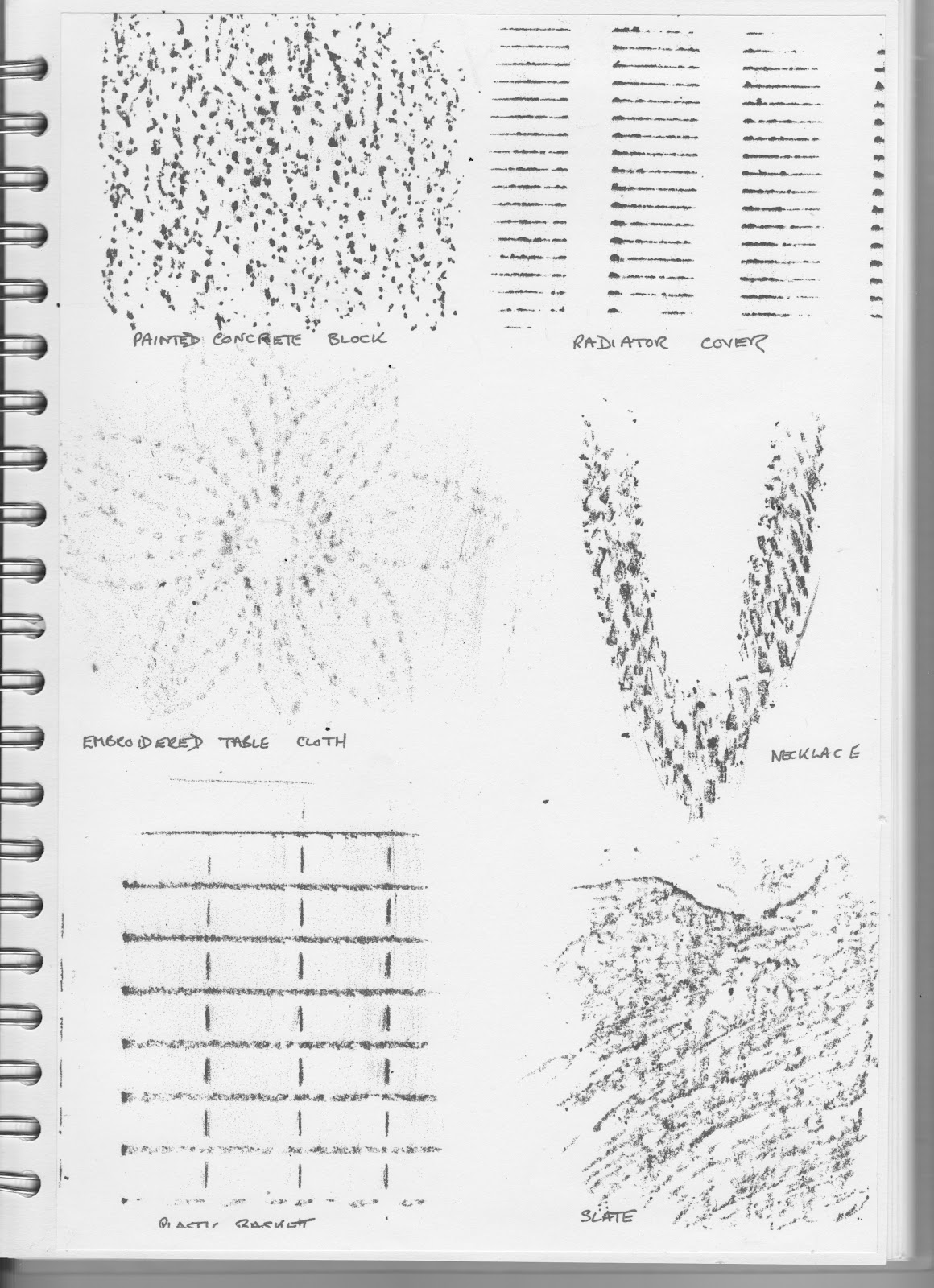
This was very interesting and the sources are just endless. However here are a few
E.A.
As I had used a fairly thin tissue for the rubbings, these were coloured in thin watercolours.
4.3.2
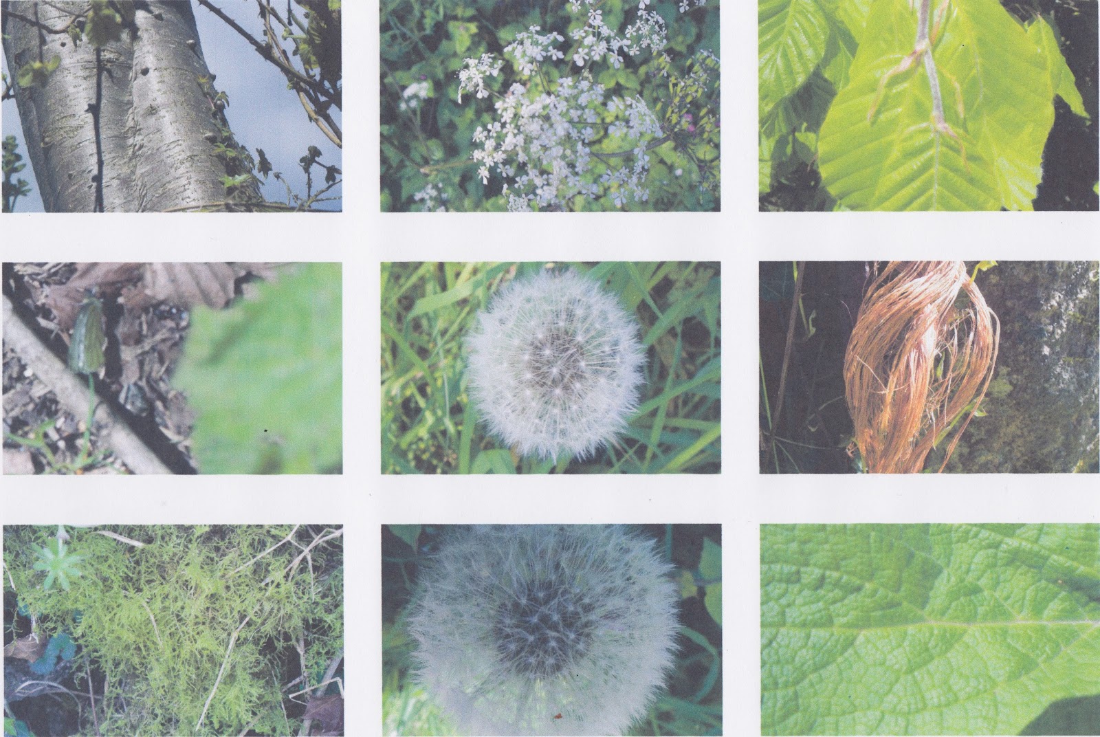
I saw a beautiful hard backed book a couple of years ago which was photos of textures, divided up into man made, natural etc. I was very tempted to buy it as I knew I would never make such a comprehensive collection but I spent a very happy time in the garden walking around taking these.
4.3.3
Drawing texture.
A) I used several ordinary pencils and a big fat Stabilo 'Woody' water soluble pencil for the background, but I didn't like the effect very much. The bramble bush was growing though the coiled up wire
B) Oak was done with HB 2, 3 and 5
C- H
F) was done with a Micron 01. I don't know what sort of bird feather this is, but I love it. G) was done with a combination of the Micron and pencil. I think it is from a sparrow hawk, left behind after he had plundered a nest of lovely long tailed tits. The bottom of it is very fluffy and the end smooth.
I'm not particularly satisfied with the above, but at least I have got going again.
Sunday, 6 May 2012
Tuesday, 20 March 2012
Chapter 2 - Drawing Tone
4.2.1
Instead of using my original drawings I did these two again, then added the tone. The method of pulling the rubber across the dark pencil is very effective and is rather like a background wash as well as giving direction. This first picture is of Hebe who is 16 years old next month and still likes to play with a ball
The pheasants are still coming in the garden and now start running towards me when I go out with yet more bird seed for the small birds, then think better of it and swerve off to one side. They get some seeds too of course. I hope they bring their chicks to show me again this year then I will try drawing them too.
Monday, 5 March 2012
Module 4 - Chapter 1
Observational drawing
I have been intending to 'have a go' at drawing my 16 year old cat for ages. So after much havering I have tried. Whether she and the other drawings are suitable for this module I am not sure and it would not take a genius to guess where I am going with these.
It is so tempting to get distracted and start putting in all the tabby stripes, but I suppose that should be left until the next chapter.
The Little owl is impossible not to draw looking like a cartoon character. The photo my friend took of him is so funny. We have both Tawny and Barn owls here, also photographed by my lovely friend.
The cat also gets on quite well with the pheasants that come visiting every day so that would be a variation on a theme. At our old house it was peacocks she used to associate with - thank goodness we do not have those here.
Hmmm still not sure whether to abandon this idea altogether and start afresh.
I have been intending to 'have a go' at drawing my 16 year old cat for ages. So after much havering I have tried. Whether she and the other drawings are suitable for this module I am not sure and it would not take a genius to guess where I am going with these.
It is so tempting to get distracted and start putting in all the tabby stripes, but I suppose that should be left until the next chapter.
The Little owl is impossible not to draw looking like a cartoon character. The photo my friend took of him is so funny. We have both Tawny and Barn owls here, also photographed by my lovely friend.
The cat also gets on quite well with the pheasants that come visiting every day so that would be a variation on a theme. At our old house it was peacocks she used to associate with - thank goodness we do not have those here.
Hmmm still not sure whether to abandon this idea altogether and start afresh.
Subscribe to:
Posts (Atom)