Tuesday, 21 February 2012

Module 3 - Creating a customised sketchbook


Cover. On thinking about the subject of this book, my weird sense of humour suggested that I take the theme literally, that combined with too many children's books from the library that fold out resulted in the following.
and the back one

The whole book put together and opened out, covers are tied loosely back to back with the same ribbon used to bind the book.
Inside front cover

For the first page I made about 8 small printing blocks from foam and used them in different combinations to make the skyline. The pages are hand stitched with thread

I made Fishing line using tracing paper for the top fold out, hand stitched with French knots and the bottom fold out is lovely and crinkly with old Bondaweb backing paper. The snow is crumpled tissue paper. This is the closed page
and this is the opened up page
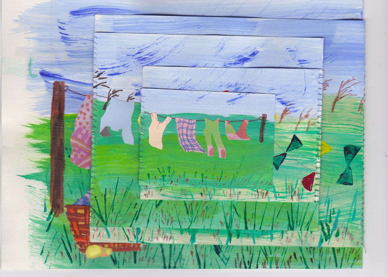
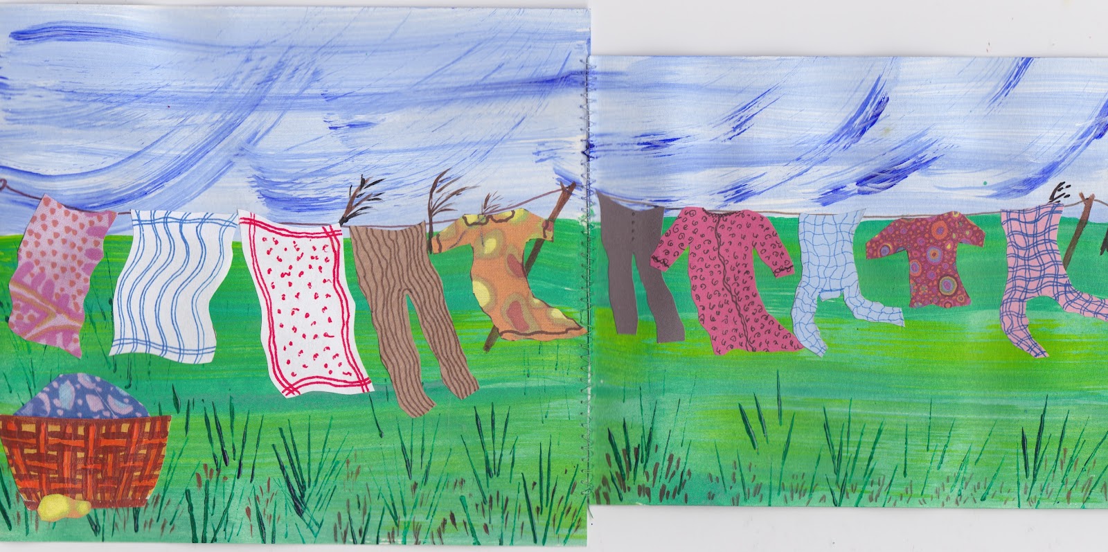
Washing line was so much fun I nearly did one or two smaller pages more. The pages are machine stitched. This is the folded up lot.
Then the opened out versions

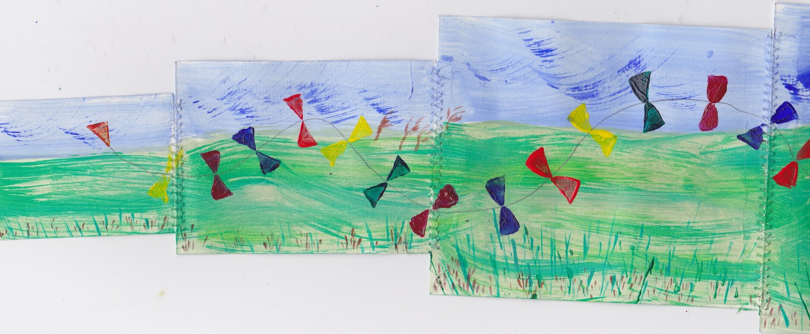
Having painted the back of the above, it was just asking for something in the same vein, hence Kite line
Life line was a variation on something I had done before. In the folded version I have made a cut hole to show the place of my childhood and then opened out page is very brief life story.

Railway line was a bit of a pickle to do. I couldn't for the life of me find a decent picture to copy and so ended up making it up out of my head. Top left folds over top right, then both fold down and in.


Heavens I have just found out I can squish two separate pictures together so I didn't need the first one, still I better not try and remove it - heaven knows what might happen. Haa, they may be squished in the draft, but they separate on the preview!

Shipping line consists of four separate pictures, the first and last have extensions. The two smaller ones are just fastened in between. The idea is that you can see lots of other boats through the top ones. First and last pages are backed with tracing paper,


Hare line inside the back cover is a variation of the outside back cover. Again this is a foam block I made from a sketch of a brooch seen in Salisbury Museum. I don't know why but I am rather attached to it.

It seemed best to scan most of the pages before I put the book together, so hopefully that was OK. It is difficult to know sometimes if I am posting too many pictures (?)  Anyway I very very much enjoyed making the book and could have gone on and on, but the samples you showed seemed to be about this size.

Thank you for another most enjoyable module - I look forward to seeing what module 4 has in store.


Wednesday, 1 February 2012

Chapter 9 - Extending the page

I had recently got my little grandson a book from the library about a moose who couldn't fit onto the page with  his little friend, even though they both pushed and shoved. In the end the friends got lots of extra bits of paper and glue and made an enormous page big enough for him to fit on. Perhaps they had done this course.

3.9.1 a) & b)
both of these pages are hand sewn. The first with purple fluffy yarn, in an over and over stitch and the second with cross stitch.

c) & d)
As you can see the first is mini brads and the second is free machined. I realised as I started on this one with the edges just butted together that is was a tricky thing to do, so paused and slipped a piece of tissue paper underneath both pieces whilst I machined them and tore it off afterwards.
e) & f)
Again with e) although it is hand sewn, just butting the edges is a little difficult.  f) is two rows of different coloured thread in running stitch down each side and then a third thread used to make ties across the two lots of stitching.
g) & h)
g) is done with punched holes made with a Japanese hole punch and fastened with different thicknesses of chenille wires. h) is again punched holes, but this time overlapped and stitched first in one direction and then back again and tied off on the middle.
i) Just a smallish zig zag on the sewing machine.
Thank goodness I have learned to turn the pictures from portrait to landscape when they are scanned.

Thursday, 26 January 2012

Chapter 8 - String Prints

3.8.1
Using my trusty map of Devon I copied the following


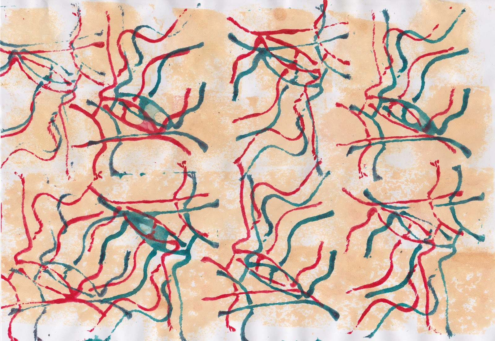
I deliberately made my string block fairly small so that I could get several prints across and down on each page.
3.8.2
a)  & b)  both done with oil pastels, then water paint wash on different weight papers
c) this one was done with black and silver crayon which gives a sharper line I think
d) no water paint wash on this one
e) & f) done on quite thin papers

g) page from old atlas
h) I wonder why this reminds me of a leaping hare when looked at in portrait?
3.8.3
Although I lined up one side of my 'made up' map for the second block, in retrospect I would like to have made it so both sides could have 'joined up' which would have been fun.
a) Done on kraft paper. I did in fact give it a deepish brown wash but of course it didn't show up
b) I liked this one. It doesn't show up but the paint wash has a slight sparkle which is very pretty. I tried scrunching up the paper first to see what effect it would have. Answer, not a lot!
c) yes, why use one colour paint wash, when you can use three. I like it.
d) I used both white and then gold acrylic on this page and was a bit disappointed with the end result, though it does in fact look much nicer than the scan shows.
An extra. Being thrifty (Scots mum) I never waste the paint I have squeezed out so I just paint up papers for future use. This is a piece a paper painted weeks ago and I have used up the gold metallic acrylic paint on it with one of the string prints only.

Well that was a great Blue Peter chapter, thank you.

Chapter 7 Drawing the landscape

3.7.1
I hadn't realised how many hundreds of drawings by Van Gogh there were. From my very large library book I choose this one of a country lane. Using the central lines when copying is very helpful.

3.7.2
I have so many pictures of Brentor Church from different angles though this is similar to one I have used before. I very much enjoyed doing this drawing.

3.7.3
Different angle this time. The rock really is very very big from here! I'm a little disappointed with this one. It helped leaving it for a day or so and then doing more to it, but still....


If Van Gogh had lived in Tavistock I am sure he would have had a great time with this church!

Tuesday, 24 January 2012

Edited version of 3.6.1

I didn't like the original version of this at all and at Viv's suggestion tried to improve it.  I first of all gave it a wash (not quite under the tap) with a weak solution of bleach which lightened it, rinsed that off and then eventually used some metallic rub-ons to brighten it up a bit.  I was looking for my Treasure Gold, but perhaps that would have been a bit much if I had found it.  Anyway it is now allowed to stay in my sketchbook and not get ripped out.

Monday, 2 January 2012

Chapter 6 - Torn Paper Lines

HAPPY NEW YEAR


3.6.1.
I tore up an assortment of papers in various colours and types and stuck them in my sketchbook. The ink wash I used was too dark though.  It almost completely obliterates the newspaper and the rest of the pieces don't show up very well either.  Just shows that I should have tried it on a spare piece of paper first!!! Not a very cheerful first page of the new year.

Make Viewfinders. Since I haven't seen my old ones for ages I was very happy to make these.

3.6.2.
Collage landscape.   Charmouth Beach
Partly because of the size,   (4 1/2" x 5 3/4") I wasn't sure if I should have put more detail in or not. The perspective doesn't look very good as the sea on the left looks odd but I was reasonable happy with the colours.

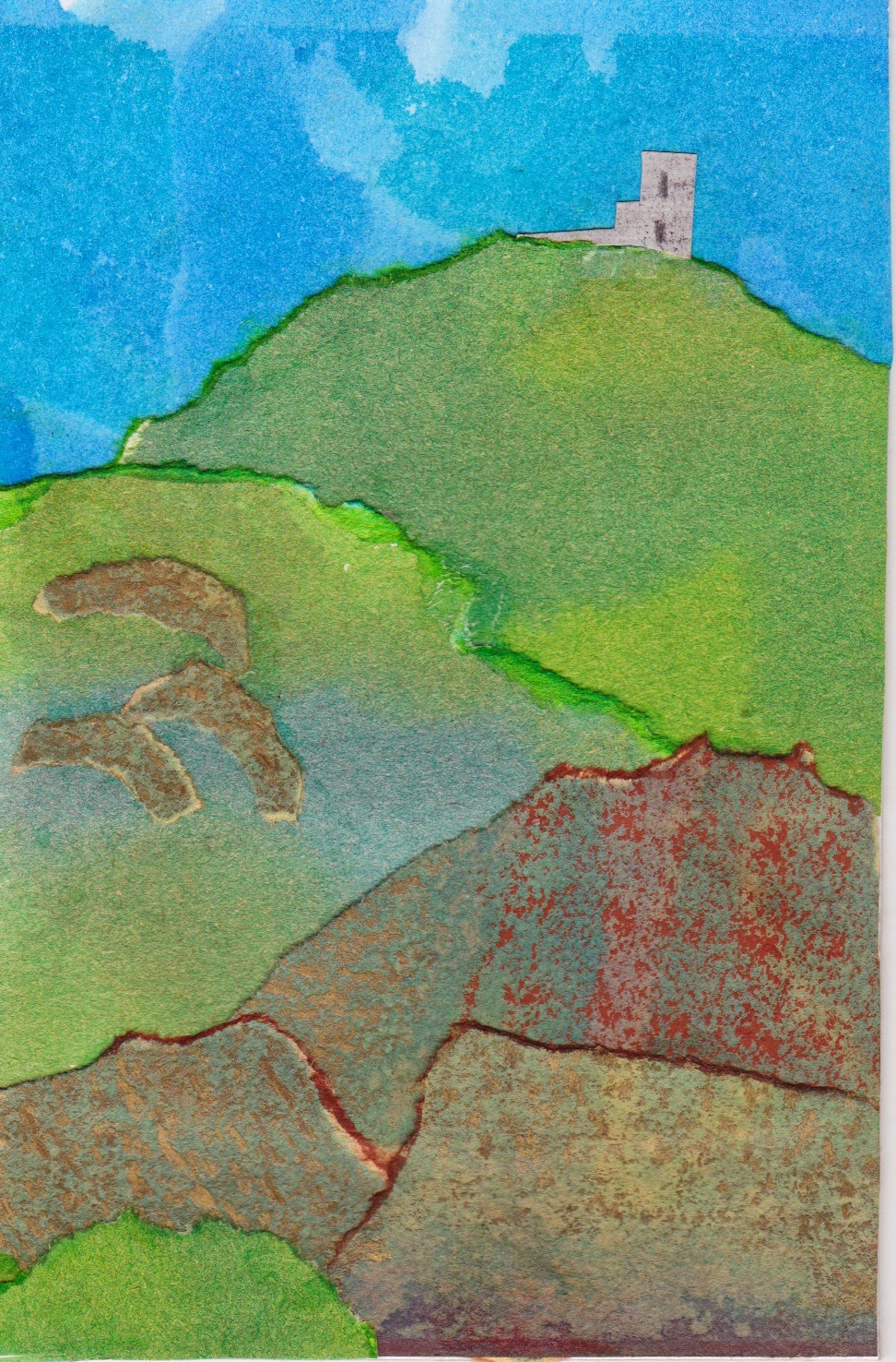
E.A.  Brentor Church, Dartmoor.
These next three pictures are even smaller as I decided that I wanted to put them together on one page of my sketchbook.  The papers are again all different weights and sources including a bit of fluffy paper I made from Kozo bark. Yes I could see these as a trio of textile pictures and yes I DO LOVE Brentor Church.