Sunday, 28 August 2011

USING MY CAMERA Chapter 8

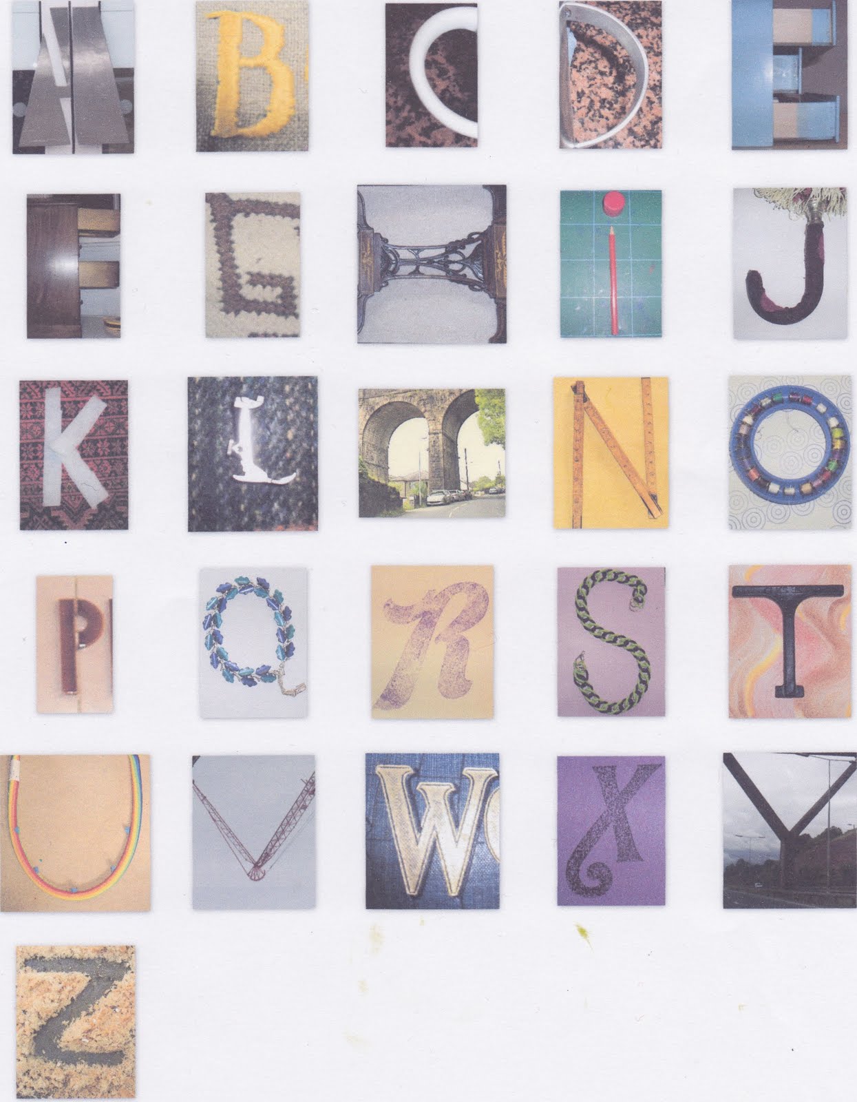
This exercise has been going on for weeks.  Of course I now 'see' letters everywhere and am slightly obsessed with them!  Although taking them all and deciding which to use and which to reject was great, the afternoon spent trying out everything on my computer was a big headache. My lovely daughter in law has moved, and is very busy so I thought I'd better give it a try.  The first lot ended up printed out on 3 x A4 sheets, which wasn't the idea. Next up was all on one sheet with a couple of repeats, but part of some letters missing.
Next try was a 'mosaic' which fitted everything together as Picassa thought best, well at least there wasn't any repeats.
Finally though I still don't know if this is what was wanted, Picassa and I together decided to give this one a go!
Well I may have ended the afternoon with a great big head ache, but nonetheless I was delighted to have learned to do some new things without any help.  I also noted the computer has kindly opened a file for me called collages with all the drafts etc in it so I can play again another day.

JASPER JOHNS Chapter 7

2.7.1
The library had nothing on Johns, but there was a great deal on line. Also many painting done "in the style of" by other people which was a bit confusing. Being able to upload a few and look at them closely was a great help. Oddly enough the one I chose to use for a colour guide didn't have that much white in it at all.
2.7.2
Using really thick acrylic for this exercise was a delight. Some of the time I waited for the paint to dry before putting another colour close by, but then I got braver and liked the slight smearing effect. In the end the colours didn't reflect the original very much, but I enjoyed doing it anyway.
The four letters are for my four lovely grandsons.

Tuesday, 23 August 2011

PRINTING CHAPTER 6


2.6.1 Printing blocks
I have a few lovely old wooden blocks in different styles as well as a set or two of acrylic letters. In addition I had already bought the alphabet set for children to play with in the bath and they have been used for that purpose quite a lot. I initially started by making just five capital letters, but then later decided I would find it really useful to have a whole set of 26 and made it up in lower case using the "American Typewriter" font. I have put them onto card, treated with button polish and put a tab on the back to make them easier to use.
2.6.2 Printing
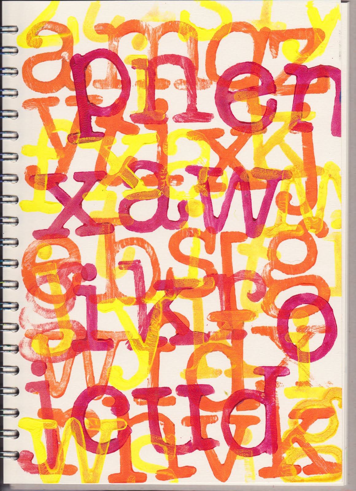
This is the capital letters I made first of all.  Although I knew it would not be the best thing to do, I tried these out first of all without any backing card, using disposable gloves. This first page is quite neat and I liked the way the J travelled diagonally down the page, also the others.

This second page with the same letters I had the paint very slightly thinner and it all got a bit messy.
Symmetrical Effects. I didn't do this in my book, but instead folded a sheet of stitched etc newspaper. I found that in order for the letters to transfer onto the opposite page the paint had to be quite runny. But if it was too runny, then I just got a blob.  Perhaps this surface was more absorbent than my sketchbook would have been.

I knew that making lower case in this style would be a little tricky in so far as they would need a couple of drawn lines to place them correctly, but in this instance I am happy to have them tipping about and up and down a bit.
This last one is from the two different sets of letters. If it had to have a title it would have to be
'No dancing'.
I have some more sheets with the letters in different directions, but haven't scanned them, they are not that special.

Monday, 15 August 2011

RECYCLED PAPERS


2.5.1
I have been saving papers for ages now and so had a good stash to work with. I also already had wallpaper adhesive, plus wallpaper border paste which can be used straight from the tube which can be quite handy. PVA of course I use a lot. I did find with the PVA (diluted) that it wasn't tacky this time and I don't really know why, perhaps Hobbycraft is a bit different?  I also used (I don't remember where I read the suggestion) a mixture of wallpaper paste and PVA. Seemed to turn out well.

2.5.2
Making up the papers was fun, though I probably thought about the different pieces a bit too much.

I really got into the weaving papers bit, though doing it on a diagonal as well was probably a waste of time, but it was fun. It all gets covered up in the end anyway.


2.5.3
I did loads of stitched papers, remembering to use an old needle that had already been used for paper. I enjoyed the free machining particularly.

and a couple of pages of hand stitching in my sketchbook. I think using chunky threads would be very effective as well, even if hard work. Painting on top would stop any tearing later.

2.5.4
I used emulsion and also white acrylic, an inexpensive Value tube to overpaint the papers. Wasn't sure if I should also do the woven ones, but I don't see them being stable enough to print on if they are not painted first, so did some of those as well. One of the painted ones is above, got them a bit out of order after all the problems I had.

With some of the above I painted one piece fairly thickly and then pressed another unpainted one onto it. When I peeled them apart there was some nice texture (the bluish one + another.

I looked at a site about Will Ashford - that is so clever. It must take a great deal of time to do though, but it makes me want to have a go (some time)
Well the floor is now covered in dozens of pieces of paper, lots of them painted so I should have plenty to start me on the next chapter.


Friday, 15 July 2011

TAKE A LETTER

Module 2  Chapter 4

2.4.1
Having chosen my letter ie  G  I later concluded that a more chunky or rounded one would have been more satisfactory. It was taken from an old wooden type block. I bought quite a few a year ago, all in different sizes and fonts.
Letter all facing the same way and coloured with Aquarelle pencils

Letter flipped from side to side. Painted with gouach
Letter flipped from top to bottom, gouache again
Letter rotated a quarter turn. Aquarelle again, some seem softer than others and so the purple came out stronger with only the same amount of pressure.
For an extra activity I thought I would copy my second piece, turn it over and from the back slice it up into different width sections in both directions, then put it back together in a different order.
2.4.2
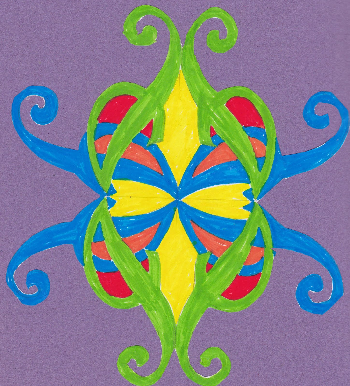
Rotational patterns using a letter template. This time I chose the letter  J  but as it is even skinnier than the G, it was somewhat tricky to make it look like much.
With large and small square. I'm aware that the pattern does not match up very well which is a bit irritating. I feel this would have been better done on feint graph paper?
For the circle inside the square I should have looked longer for my compass, rather than using a bowl, then trying to fit the square around it.
This final one was done with felt tip. I couldn't face doing the background in this medium and wasn't sure what colour I wanted, so I cut it out. I had then proposed to try it on several different backgrounds and photograph them, but the darn thing curled up so much I just chose the background and glued it on!

Monday, 20 June 2011

MODULE 2 DRAWING WITH GLUE

2.3.1  I thought I would take a pic of the glue writing before it dried. Done on shiny card
2.3.2 This is the first rubbing, done with wax crayon.

Also wax on music paper from book of music
On newspaper, which was much easier because it is thinner
Still using wax, done on pink cotton, "raining" on opened out teabag paper, "heart" on dry 'wet wipe'
The muslin one shown next was done with oil pastel and because the weave is so loose was a bit tricky.
Oil pastel on tissue
On ordinary copier paper, still oil pastel
2.3.3. The above (ie oil pastel)  with a wash of green and pink
This one is done with yellow and green, over wax crayon. The wax doesn't smudge as much as pastel
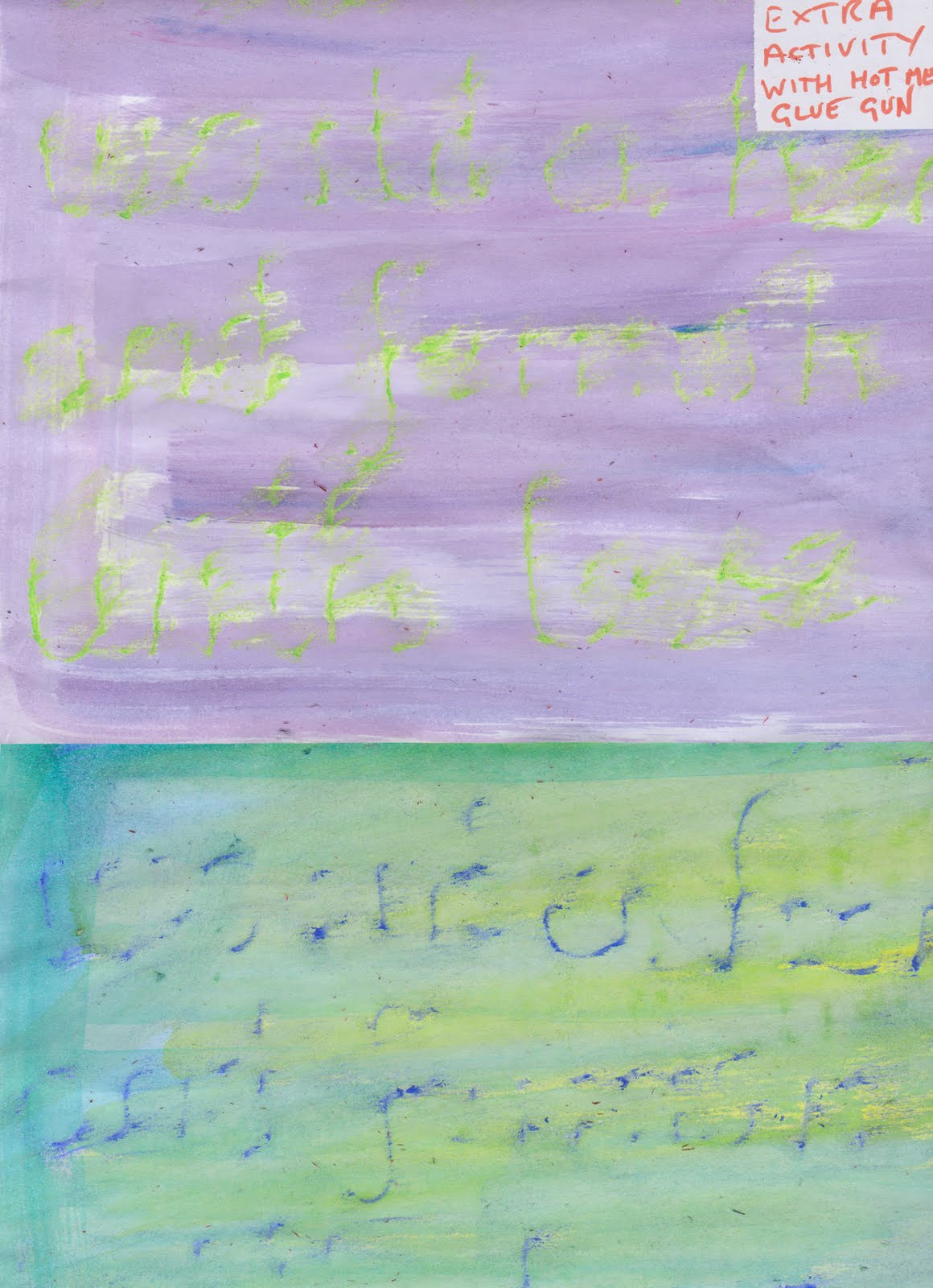
The following are I suppose "Extra Activity", but not quite what was asked for because it is done with a hot melt glue gun. The lettering is of course more bumpy. I should try ironing over it (with a Teflon sheet) and see if it makes it more even. It has been given a wash of acrylic ink.
Then a couple of rubbings done of above, half a sheet of two on tissue paper, then given a wash of paint.
Two more half sheets, these are the hot melt writing with Oil pastel instead. They are more indistinct than wax crayon
Next is still over the hot melt, oil pastel over newspaper and the bottom half is ditto on black tissue paper, which doesn't really work

Finally one more hot melt glue on card with paint wash.

Sunday, 19 June 2011

MODULE 2 HANDWRITING

Just a couple of pics of text seen recently, The first one was taken at the local library, so they were obviously doing something with text and the second was on a box of chocolates in the supermarket. No I didn't feel the need to buy the chocs.