Monday, 13 June 2011

MODULE 2 HANDWRITING

2.2.1
As you can see, I love using this soft Gel marker.
I wasn't really sure what I was doing here. The bottom bit with writing in two directions is more interesting than that above
When doing this next page I unintentionally got a bit ahead of myself and subconsciously used some bits of Zentangles

There are actually three lots of writing in different crayons on this page, but I obviously didn't press hard enough with the lighter ones. They are written in different directions
However this time, I pressed harder and am pleased with the page, especially the pink and purple colours
on green
What a horrid page this one is. Although I again pressed hard, the wash of black dilute acrylic paint swamped it and I ended up blotting some of it off as there was no sign of it 'coming through'
I'm singing the next bit  "...and it's getting better every daaaaay" etc. I love Zentangles and for about 9 months I used to do a bit most mornings at breakfast time in a little 4" x 4" book. this however was done with a much bigger Sharpie marker which is a revelation and means it can obviously be done on a much larger scale.
Oh this was great fun too.  Are we going back to the sixties I wonder. Done in gouache, mostly blue and yellow with a little bit of purple to give a bit of a lift, but it looks rather brown.
Writing in circles - yes I like this it is very effective. Words taken from a Bruce Chatwin book and done inMarvy le Plum 11 with paintbrush end and fine end
The spacing on this page of names is not quite close enough I  think which results in some rather large patches. Still overall effect is quite pleasing. Painted with gouache. Perhaps I should have restricted the colours a bit more but hoped that as they are pastel is isn't all too much.

I made sure to do the spacing closer this time. I used acrylic ink which I haven't tried before and applied it with the dropper that comes with the bottle. Unfortunately it got splodged before it was completely dry but I like the differences in the density of the ink.

I decided against doing any extras after I had loaded this lot and realised that I had already spent quite a lot of time on it.  I will do some more writing around shapes sometime soon though, just for fun.  Altogether a most satisfying chapter.

2.1.3

Words and letters. A very small selection of the many many papers I have been collecting for ages. I particularly like the old map ( price 2/6) and the music books. It is wonderful to have a justification for having kept them all this time.

Still haven't got out and about much to take pics of letters and numbers, though there are some lovely old tile signs at Exeter St David's station I want to take when I go back next month.

Thursday, 26 May 2011

MODULE 2 WORDSEARCH

FANTASTIC FONTS

My blank book came in the post after I had done most of the pages, so they have been scanned not in the book and will be put in. I did the front cover in a bit of a hurry and may add a bit to it later. The 'undressed' books are very good value and it is fun to do ones own thing on them.

2.1.1
There are just so many fonts that I like, I could have chosen dozens. The first page I printed out in colour, the second was an actual page from a book of sheet music, I was a little surprised that it went through OK. I made sure to try the blue tissue paper when my dh was out of the house, but that too behaved (it was well glued down around the edges) The grey background was a paper bag opened up, I have had it for ages because I like the colours/patterns. Next painted paper, wrapping paper and not shown because it wouldn't look like anything (?) tracing paper which went through beautifully.

I have no idea why this turned around, it was supposed to be half a page of painted paper, as shown and the other half should have been spotty wrapping paper. I'm having a tricky day with computer today.  

2.1.2.
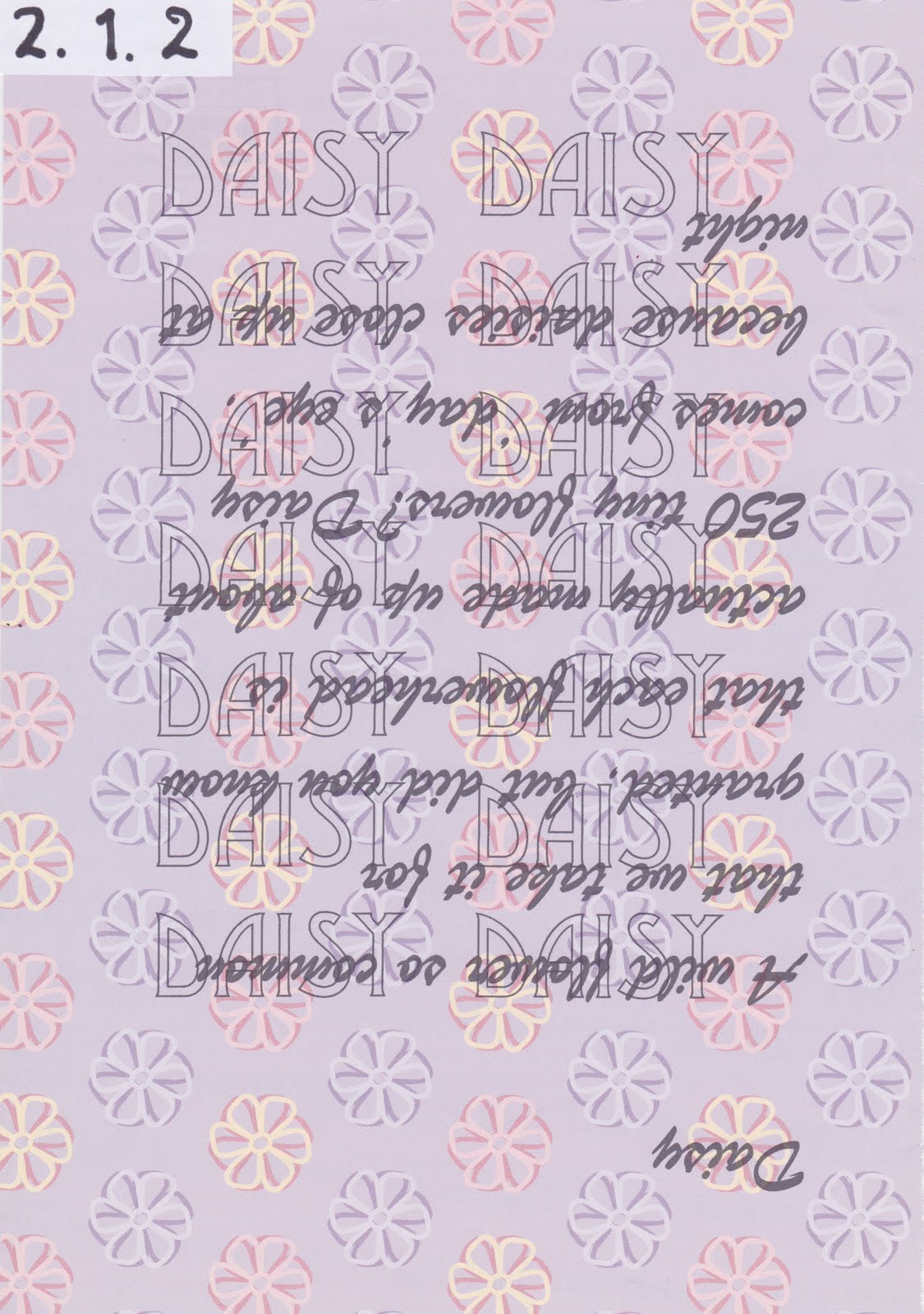
This one I printed on freebie scrap book paper, I thought the background appropriate to the text.

The same font and words were done both ways up. Although the writing is not very easy to read, I think the shapes of the words look very satisfactory.

Now for something more colourful. But is it what was asked for - hmm not sure. Its Inktense background, with wax and  Le Plume as well. If you dry paper on top of the AGA for a minute you get a well textured surface!

2.1.3
I enjoyed finding all these fonts, but why did that little voice in my head tell me to make something more of it, not just arrange them in a pattern.
2.1.4
I have a large collection of appropriate papers now. In fact some of them I have had for absolutely ages knowing that they would be useful one day. I would have photographed them, but my camera is on the  blink and I wanted to get some of this work posted. This of course also applies to taking shots of letters and numbers when I'm out and about. I will post these as soon as I can.

Saturday, 23 April 2011

CHAPTER 10 - ZIG ZAG BOOK

What an interesting project. I was eager to get started but the only paper I had in A3 size was 300 gsm! So I obviously didn't doubled it over as I could never have made the folds the other way. I cut it in half and ended up with 16 pages.

10.1 As many of my friends know, I love fuchsia, so when I found this "I think I love you" in a magazine in the right colours, it had to be the cover page. It is shown together with the back page which has a picture of one of my favourite Lea Stein brooches.
Out of interest I googled FUCHSIA and came up with some interesting information, a little of which is on the next two pages. This is again mostly magazine paper, plus a fabric heart made of cut pieces of chiffon, and the edges coloured with crayon.
Life's little essentials... no I don't wear these sort of things very much though I have a lovely pair of sandals in this colour and a bag as well. The tree broach was made by my lovely daughter in law.
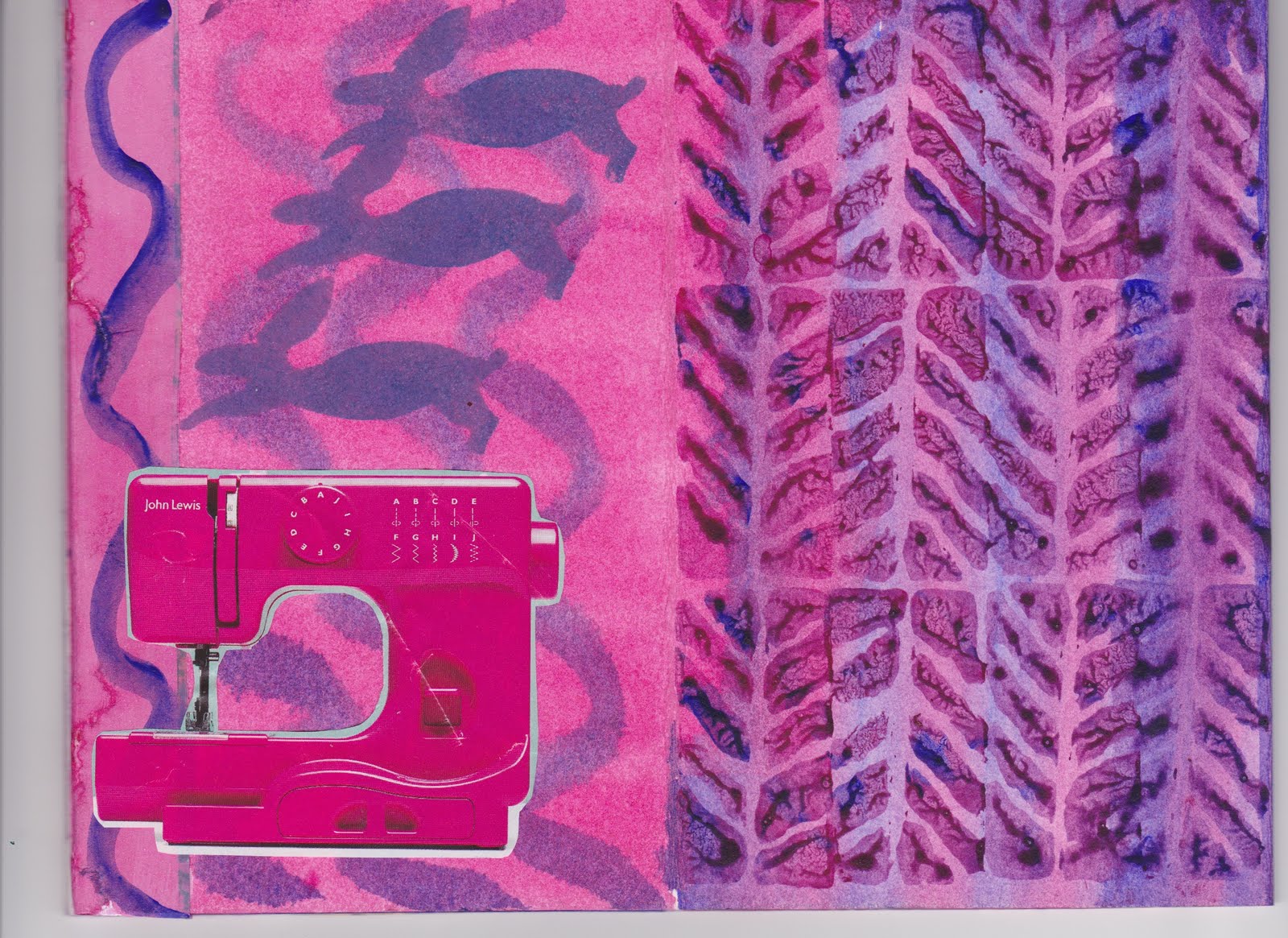
Sewing machine with hares. No I don't own a machine this colour, but if someone gave me one I should love it. The hares are printed with a block I made from Fab foam (I found the hare in Salisbury museum, it was a very small bronze broach and I had to draw it, likewise some very odd little jumping figures in holes in the middle, shown later.) Backgrounds etc are all acrylic.
Mmmm, I do like dark chocolate, it makes me jump for joy too.
This reminds me of my youth, though I don't think my dress would have been quite so short.
Two pages with nice gooey paint, squashed together and then pulled apart. The cut out hearts have a loose middle fold over section which just seemed to 'need' to go down the middle.
Last two, though they are in fact either side of the above pages, but it seemed better to scan them this way. Bubble wrap pressed onto one page and then the resulting painty bubbles, pressed onto the other.
Two photos of the two different sides.
All together great fun. I didn't expect to get it finished this side of Easter, but I'm looking forward to Module 2 now.

Thursday, 21 April 2011

CHAPTER 9 GIUSEPPE ARCIMBOLDO

What a strange idea.  Well obviously the various Hapsburg emperors liked his work. I wonder what his waterworks constructions were like as that was another part of his job. Still I like a man with a sense of humour.

9.1 Finding enough pictures of fruit and vegetables is quite tricky. But by playing around for quite a while I managed to come up with this.

Wednesday, 20 April 2011

HAPPY EASTER

chicken potato prints, I couldn't resist doing these a couple of weeks ago.

Tuesday, 19 April 2011

Chapter 8 Matisse & colour

8.1 I got a very good book out of the library on Matisse and it was a pleasure to read through it. I had forgotten many of pictures he painted at the beginning, were quite conventional, also that he, like many painters made sculptures.  The paper cutouts he did towards the end of his life have always fascinated me. This exercise on Matisse reminded me that when I was a child living in St Lucia, we had a reproduction of Matisse's Black Fern on the wall.  I always used to wonder why the lady had a table leg on her lap!

8.2 I took some liberties with my interpretation of a still life with fruit, insofar as the tablecloth was much more complex in the photo. I think the green stripy and spotty cushions are a bit too much for the fruit!

8.3 Like the one above, this was also painted in gouache but gave me far more trouble. I don't think I should have used the same fabric as background and foreground. I made a small foam block for the paisley pattern in the fabric. The colour of the small jug gave me lots of grief and got changed several times.
 8.4 + 8.5 I couldn't do the colour change on either Picasa or the basic photoshop programme on my Mac, so had to enlist the aid of daughter in law for these.