8.1 I got a very good book out of the library on Matisse and it was a pleasure to read through it. I had forgotten many of pictures he painted at the beginning, were quite conventional, also that he, like many painters made sculptures. The paper cutouts he did towards the end of his life have always fascinated me. This exercise on Matisse reminded me that when I was a child living in St Lucia, we had a reproduction of Matisse's Black Fern on the wall. I always used to wonder why the lady had a table leg on her lap!
8.2 I took some liberties with my interpretation of a still life with fruit, insofar as the tablecloth was much more complex in the photo. I think the green stripy and spotty cushions are a bit too much for the fruit!
8.3 Like the one above, this was also painted in gouache but gave me far more trouble. I don't think I should have used the same fabric as background and foreground. I made a small foam block for the paisley pattern in the fabric. The colour of the small jug gave me lots of grief and got changed several times.
8.4 + 8.5 I couldn't do the colour change on either Picasa or the basic photoshop programme on my Mac, so had to enlist the aid of daughter in law for these.
Tuesday, 19 April 2011
Sunday, 27 March 2011
Chapter 7 Simple Printing
7.1 Choosing a floret of broccoli wasn't the easiest option but it held together long enough to do one page full.
7.2 Red and ochre potato print. Looks a bit like a lower case 'a'. Don't care for it much
This version on blue tissue was a bit tricky, it wanted to stick to the paper and tear.
The next cut looked like arms and legs. Not much interest in first lot done with yellow, but it improved with offset red overprinting
This on black background is probably my favourite. A rectangle with leaf like cuts done in two colours at once.
7.3a Card printing. The first one in pink and gold didn't flow in the way I had hoped it would. Perhaps I should have left more space which would have improved the negative shapes?
7.3b Orange on yellow, hmmm still not very good.
7.3c Blue/green. I like the colours and the effect but the paint was a bit too runny at this point.
7.3d Green on checked background. I very much like the lacy effect, when there is less paint on the block and this one shows it better.
7.3e Light to dark green. I like this one. Perhaps because the block is quite complex, a more simple pattern works better?
7.3d I only had a scrap of this printed tissue paper left, but thought I would give it a go. This background wrapping paper is so useful I've used it lots of times for projects.
What a lot of pages, I hope that isn't all a bit much.
Friday, 25 March 2011
Chapter 6 - Colour Matching
6.1 I was delighted with this picture when I found it, the colours are so vibrant. It was a bit small, but beautiful. Perhaps I should have left a small space between the pictures and the mixed colours to make it more obvious where one ends and the other begins.
6.2 Although I pressed very hard with my white crayon, it was quite a pickle to see where I had been when it came to putting the colours on it. I wished it had been on the page opposite 6.1 as it would have been easier to check on proportions of colour instead of flicking back and forth.
6 + As soon as I put the first two colours on this one, I thought of Easter! Don't know if it was subconscious or not. Anyway a photocopy of it may become the background to an Easter card.
6.2 Although I pressed very hard with my white crayon, it was quite a pickle to see where I had been when it came to putting the colours on it. I wished it had been on the page opposite 6.1 as it would have been easier to check on proportions of colour instead of flicking back and forth.
6 + As soon as I put the first two colours on this one, I thought of Easter! Don't know if it was subconscious or not. Anyway a photocopy of it may become the background to an Easter card.
Thursday, 10 March 2011
Chapter 5
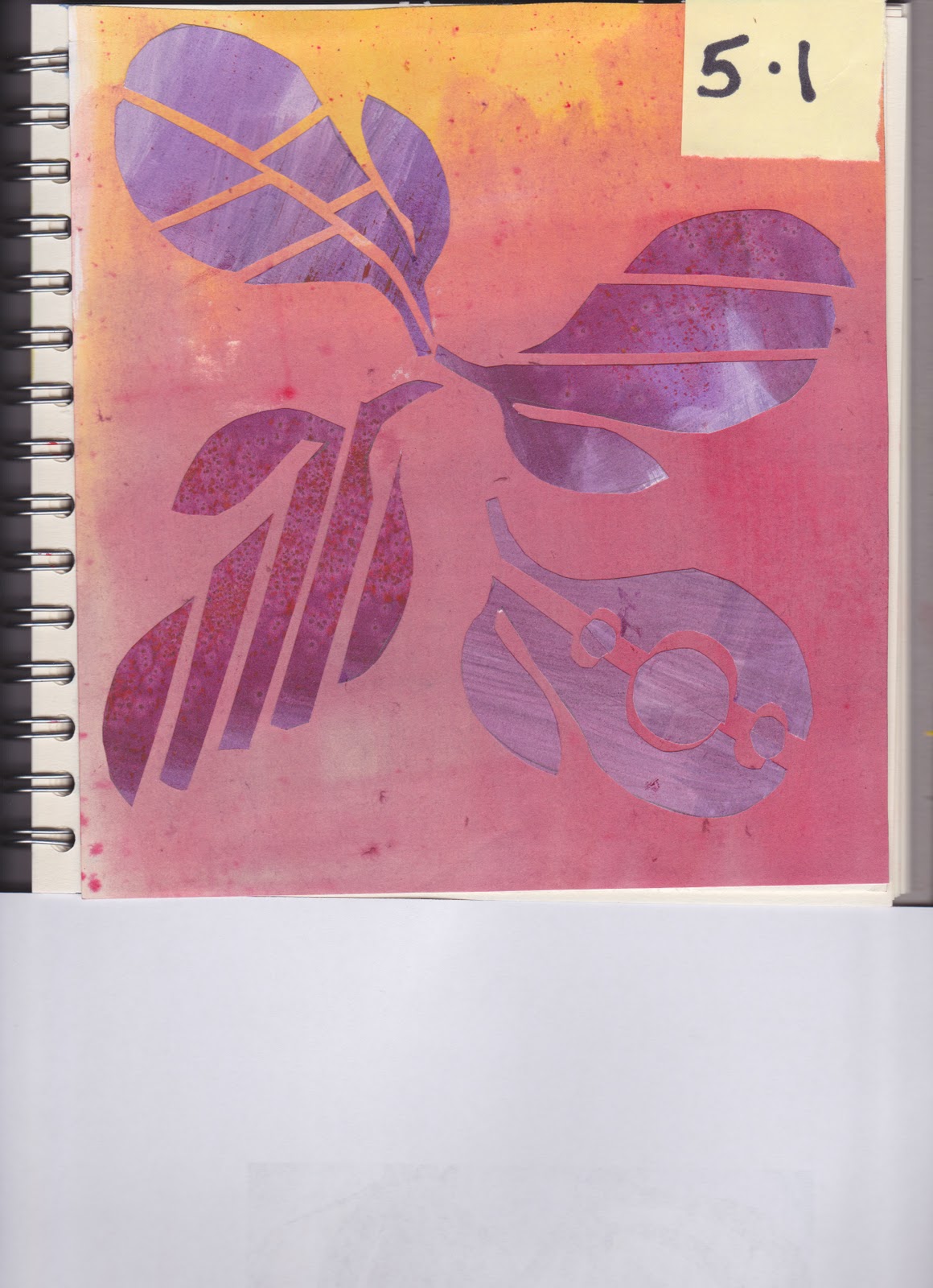
5.1 The first part of this chapter was most enjoyable. I found cutting up the shapes and spending some time rearranging them very interesting, though perhaps the page with black background was not quite what was required.
The next part of the exercise got off to a bad start. My chosen picture was a bunch of asparagus, which was probably too complicated, though I thought I had traced it simply enough. Then I did the cutting using some of my painted papers that were done on far too heavy a weight. The whole lot went in the bin! Back to the drawing board and the onions were more straight forward, plus this time the paper was much thinner and easier to cut. There must of course be countless combinations, but I photographed five and then put a sixth into my sketchbook. I thought the four to a page was OK? I could do them separately if needed. Anyway here they are.
I still haven't sorted out the extra bit of the paper at the bottom when I scan, even though I was given ways to sort it. Hmmm the sketchbook is getting pretty full and so I shall solve the problem by getting an A4 next time.
The next part of the exercise got off to a bad start. My chosen picture was a bunch of asparagus, which was probably too complicated, though I thought I had traced it simply enough. Then I did the cutting using some of my painted papers that were done on far too heavy a weight. The whole lot went in the bin! Back to the drawing board and the onions were more straight forward, plus this time the paper was much thinner and easier to cut. There must of course be countless combinations, but I photographed five and then put a sixth into my sketchbook. I thought the four to a page was OK? I could do them separately if needed. Anyway here they are.
I still haven't sorted out the extra bit of the paper at the bottom when I scan, even though I was given ways to sort it. Hmmm the sketchbook is getting pretty full and so I shall solve the problem by getting an A4 next time.
Thursday, 3 March 2011
The spotty purple, lilac pink doesn't look too analogous does it? The yellow green blue is a bit far apart as well in terms of related colour? Cling wrap was put on top of the wet paper, but perhaps it had already got a bit too dry by the time I did it. I like the brown, orange, yellow best of the lot.
I have had to upload these next four separately, as I am having problems again!
Chapter 4 Coloured Papers, last bit
I decided to go back to gouache for these last eight pages. The yellow and purple was achieved by using yellow crayon as a resist.
Subscribe to:
Posts (Atom)